A huge number of cars drive along the roads, many of which are well recognizable, while others are known only by a few motorists. It is almost impossible to list literally all the companies that manufacture cars. In many countries of the world there are enterprises that produce vehicles under their own brand, or as a representative of the world famous auto concern.
It is not surprising that European and Korean models are assembled in Russia, not forgetting to support the domestic auto industry.
It will be interesting to know which cars and from which country end up on our roads, what their logos look like and what they mean.
Countries-automakers
A number of countries are also known for their outstanding automotive industry. Germany has always been considered an exemplary manufacturer of the best machines in the world. It cannot be said that the Germans are now alone holding the leadership in the market, but their cars are definitely considered one of the best.
To make it easier to classify car brands, they were divided into several categories, depending on the country of the manufacturer. Plus one big category has been added.
As a result, the following cars will be considered:
- Japanese;
- American;
- Russian;
- German;
- Korean;
- chinese;
- European.
It is unlikely that it will be possible to cover literally all car brands. Keep in mind that there are far more car manufacturers in history than there are today. Plus there are small firms that are sometimes known only within one state.
Japan
To begin with, consider the well-known and not-so-famous brands of cars that came from Japan. Most of them are well known to Russian, European and American consumers. But the list also includes Japanese cars, the brands of which may not be all that familiar.
- Acura. A well-known division of the Japanese brand Honda. It was here that the first premium cars, created to compete with European auto giants, began to be made. The logo features a caliper. It is a special tool that allows you to accurately measure parts.

- Daihatsu. Not the most popular and well-known Japanese brand in Russia, which is gradually becoming more recognizable. The brand has been controlled by Toyota since 1999. The logo is based on a stylized letter D.

- Datsun. Once an independent brand that was acquired by Nissan in 1986. Only since 2013 has an independent production of cars under the Datsun brand been launched. The badge bears the flag of Japan and the name of the brand itself.

- Infiniti. Premium division of Nissan. Interestingly, the original idea behind the logo design was to use the infinity symbol. But the management changed its mind, as a result of which a road rushing into the distance appeared on the badge.

- Honda. One of the most famous Japanese brands. They didn’t come up with anything regarding the logo. It's just the beautifully designed first letter of the brand name.

- Isuzu. The badge is made in the form of an original designed capital letter.

- Lexus. Another premium division, but this time from Toyota. For the logo, we chose a capital letter, tilting it, and enclosing it in an oval.

- Kawasaki. For most car enthusiasts, this brand is associated with motorcycles, although the company also produces cars and other equipment. The logo is extremely simple. This is a brand name made in a beautiful style and with a dark background.

- Mazda. A well-known brand all over the world. The icon looks like a capital letter, which seems to spread its wings. Some people think that the logo depicts a seagull, an owl or a tulip.

- Mitsubishi. Cars of this Japanese company are decorated with badges made in the form of three diamonds. This is due to the fact that this is how the name of the company is translated.

- Nissan. A popular car manufacturer that is one of the most recognizable representatives of the Japanese market. The logo is made in the form of a rising sun against the background of the company name.

- Subaru. The brand has been around for over 100 years. The icon depicts 6 stars, one of which is slightly larger than the others. It symbolizes the merger of 6 auto companies.

- Suzuki. Initially, the company was engaged in weaving looms and motorcycles. The first cars under this brand left the assembly line only in 1973. The badge is made in the form of the first letter of the brand name.

- Toyota. Since the company began its history with weaving equipment, the logo depicts a thread that is threaded through the eye of a needle. Despite the change in business profile, management decided not to change the badge.

- Yamaha. Another alleged motorcycle manufacturer. But they also make engines for cars, which is why the company made it to this list. The logo displays 3 tuning forks that are crossed.

The Japanese car industry is widely known throughout the world and is highly regarded by motorists from all over the world. Among them there are leading companies that regularly win the most prestigious awards and rank first in reliability ratings. This speaks of the highest level of car production in the country.
USA
The American auto industry occupies a separate place in the global car production. It was here that the history of the automotive industry began.
There are a number of companies in the United States that offer their cars all over the world. But there are also manufacturers that specialize in purely. Therefore, many are rightly interested in what car brands American companies are ready to offer, and what is depicted on their logos.
- Dodge. The company has a very rich history of existence, during which it was reorganized several times, merged with other brands. The logo itself has also changed. Since 1994, it has remained unchanged, and is made in the form of a metal shield with the image of a bighorn sheep on it.

- Eagle. A well-known company in the USA, whose machines have proven themselves in many countries of the world. From the name it becomes obvious that an eagle must be present on the logo. And there is. This is a gray head of a bird of prey with the name of the brand itself on top.

- Chrysler. The history of the company began back in 1924. The icon depicts a design in the form of wings. As the manufacturer says, it is a symbol of speed and strength. The logo is somewhat reminiscent of the badges used on British Aston Martin and Bentley.

- Tesla. A brand that is gaining incredible popularity, specializing exclusively in electric cars. The logo depicts the letter T, which looks like a sword.

- Buick. The logo of this company depicts three swords in a special stylized frame.

- Ford. The most famous brand with the simplest logo possible. Company name on a blue background. But, as history has shown, the beauty of a badge does not guarantee success.

- Jeep. Also, the design is extremely simple, which has not changed for many years.

- Chevrolet. A very popular American brand in Russia and the CIS countries. Its logo displays a golden cross or plus. Despite the seeming simplicity, almost everyone will recognize this icon.

There are some of the largest automakers in the US that control other popular brands. General Motors alone includes brands such as Buick, Cadillac, Chevrolet and GMC's own brand.
Chrysler is considered another giant auto concern. This is not surprising since it includes Jeep, Eagle, Dodge, Plymouth, Imperial and a number of other auto companies.
Russia
And motorists just need to find out which Russian car brand appears here by the badge on the hood of the car.
To the great regret of many, the Russian car industry is seriously lagging behind world leaders and even the middle peasants. There is only one large brand in Russia, as well as several smaller companies. But even they are very popular at home and in the CIS countries. Largely due to the adequate price and gradually increasing quality.
- Lada. Togliatti company that produces more than half of all domestic cars. The most famous and most recognizable brand. Its logo depicts an ancient sailing boat enclosed in a stylized oval.

- Volga. The company appeared due to the joint efforts between GAZ and the American brand Ford. Domestic enthusiasts wanted to meet consumer demand for luxury cars at the expense of the Volga. How much it turned out, judge for yourself. The Volga was once truly a luxury. The logo remained from GAZ. It depicts a deer against a background that resembles a shield.

- ZIL. Once a world renowned limousine maker, the icon displays stylized letters from the brand's name. Now the company has switched to the manufacture of trucks, tractors and buses.

- Moskvich. Cars under this name began to be produced even before the war. But they were not in demand. After the war, thanks to technologies borrowed from Opel, it was possible to develop a more successful and interesting version of the Moskvich, which was based on the German Kadett. The logo depicts a stylized letter M.

- UAZ. This Russian company specializes in the production of SUVs and more. The icon is easily recognizable, it is presented in the form of a ring, inside which there are wings. During its history, the brand has changed about 10 logos.

- KAMAZ. One of the best heavy vehicle manufacturers in the world. Gained immense popularity after successfully participating in survival races, the route of which runs from Paris to Dakar. The badge depicts a horse with the name of the company itself below.

There are not so many manufacturers in Russia. Now the practice of producing cars of foreign manufacturers is being actively introduced. As a result, there are a number of Russian-assembled foreign cars on the domestic market. This makes it possible to significantly reduce the cost of cars for end users.
Germany
Despite the fact that Germany is a direct and most important part of Europe, it would be fair to separately single out this country as one of the world's leading car manufacturers. Their brands are definitely known all over the world. And every second person dreams of becoming the owner of a German car.
It is a mistake to think that Germany is represented only by the leading three in the person of Mercedes, Volkswagen and BMW, as well as the companies they control. You should consider all well-known companies, and find out about the emblems of German cars.
- Wiesmann. Although the company closed a few years ago, its cars are still on the road. Sports cars were produced here in strictly limited quantities. The logo depicts a gecko. Thus, the management tried to show how stable their cars are on the road. After all, this type of lizard is known for its ability to easily move along walls and ceilings.

- Volkswagen, a company that needs no introduction. The icon depicts the stylized letters W and V.

- Trabant. The name translates as a satellite, which is due to the launch of the first artificial satellite in history. Thanks to him, such a name for the auto company appeared. The icon displays the letter S.

- Smart. The company specializes in highly compact and efficient city cars. The icon displays the letter C and is complemented by a yellow arrow.

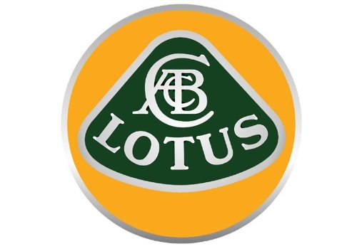
- Porsche is a world renowned sports car manufacturer. Although it already produces sedans and crossovers. The logo consists of elements of the coat of arms of Baden Württemberg (deer antlers and stripes in red and black), as well as the symbol of the city of Stuttgart (horse on its hind legs).

- Opel is a car manufacturer with a difficult and enviable history. But now everything is going well for the company. On the logo, you can see a circle with a lightning bolt inside it.

- Mercedes. A brand that is controlled by Daimler. The icon displays 3 beams. They symbolize superiority in the air, on land and on the water. A reference to a rich history, when the company produced not only cars, but also airplanes and water transport.

- Maybach. A German company that makes incredibly expensive and luxurious cars. The emblem displays 2 letters with different sizes.

- MAN. The brand is best known for the production of trucks. The badge now displays the name of the company, as well as a silvery arch. There was also a lion on the logo earlier, but since 2012 it has been moved to the rim of the radiator grill.

- BMW. Almost every car enthusiast knows that at one time this company produced engines for air transport. Hence the corresponding propeller logo.

- Audi. Their icon represents the merger of 4 companies. Made in the form of 4 chrome rings.

- Alpina. The company is engaged in the refinement of BMW cars for a special order of customers. The logo looks stylish and original. Two car parts are depicted on a blue and red background, placed on a shield and enclosed in a circle.

Germany is truly an automobile country. She has a huge number of companies and industries on her account.
It is not for nothing that the Germans are considered to be the manufacturers of the highest quality cars. Although it should be noted that in recent years, their positions have been significantly shaken. Competitors continue to build on their advantages. But this in no way prevents the leading German car brands from remaining incredibly in demand around the world.
Europe
A large number of car manufacturers are concentrated in Europe, many of which are easily recognizable. It is not so easy to compile a complete list of Italian car brands and the same French car brands.
Do not forget about the famous and widespread cars of British origin. For many, English cars are associated with high prices. The English brands for the most part belong to the expensive segment, which cannot be said about the pricing policy of the same French cars.
By combining the most popular European brands, which include English, Italian, French and other brands, we can present the following list:
- Alfa Romeo;
- Bugatti;
- Fiat;
- MAserati;
- Volvo;
- Skoda;
- Aston Martin;
- Bentley;
- Seat;
- Rover;
- Saab;
- Ravon;
- Lancia;
- Land Rover, etc.
Let's consider several brands of cars of European production and study the features of their logos.
- Rolls Royce. The badge consists of the first letters of the names of the founders of the company. Rolls and Royce inscribed their names over 100 years ago. All cars of the brand are presented in the premium segment. The logo displays two Rs that are superimposed but slightly offset.

- Land Rover. Initially, axes and spears were displayed on the logo of the cars of this brand. But then it was decided to change the badge, as a result of which there is now a rook, which was used by the Vikings at one time. This vessel has a red sail.

- Ferrari. One of the most recognizable logos not only in Europe but all over the world. It is a black horse on its hind legs with a yellow background behind. The badge also features the letters for Scuderia Ferrari and the colors of the Italian national flag.

- Lamborghini. Ferrari's answer showing an angry bull on a black background. It is very difficult not to recognize this logo.

- Fiat. A concern that unites almost all leading Italian car brands, including Ferrari. The logo has gone through many transformations. As a result, it was not possible to make a final decision. Then a square and a circle were left on the badge, supplemented by the name of the company.

- Renault. Their icon symbolizes a diamond.

- Peugeot. A well-known French brand that is easily recognizable by its corporate logo. It depicted a lion.

- Citroen. The company was originally engaged in the repair of steam locomotives. And the badge displays 2 chevrons, which underscores the manufacturer's rich history of service.

- Volvo. When developing its logo, the once purely Swedish company used the weapon of the god of war Mars. For the badge, they took his shield and spear. The diagonal line originally served only to anchor these two elements. But it soon became an integral part of the logo.

- Jaguar. Another British carmaker whose name quite explains the choice of the badge. The forward-looking predatory jaguar symbolizes power, speed and strength.

Europe is very rich in a variety of cars, ranging from simple budget solutions to incredibly expensive, luxurious and exclusive models worth several million euros.
Korea

Modern Korean cars, despite a rather modest list of existing companies, are associated with high quality and affordable prices.
China
The Chinese auto industry has not been taken seriously outside the country for a long time. All the cars produced were low-quality copies of well-known brands, but did not meet the strict requirements for quality and environmental friendliness at all.
But gradually everything changed, and the perception of Chinese cars changed the vector. Already now their names and signs are well recognizable, cars from the Middle Kingdom are actively bought in Russia, the CIS countries and even Europe.
There are several of the most significant brands that came from China.
- Zotye. Not the most famous Chinese brand, but gradually spreading around the world. These cars can be recognized by the stylized letter Z on the hood.

- Lifan. The logo of this company is based on three sailing ships. By this, the manufacturer is trying to show that they are racing at full speed.

- Landwind. On domestic roads, you can find many crossovers and SUVs of this brand. The icon is depicted in the form of a red diamond, inside which a stylized letter L was placed.

- JMC. Quite simple, but memorable logo, made in the form of 3 triangles and supplemented with the name of the company at the bottom.

- Higer. A capital letter was used for the logo. But the most interesting thing here is that the idea was taken from the Hyundai company. There are also supposedly two people shaking hands.

- Haima. In many ways, the icon resembles the symbols of the Mazda brand, with a slightly modified “bird” inside the circle. The fact of external resemblance to the logo of the Japanese brand cannot be denied.

- Hafei. The logo is based on a shield, and against its background are displayed two waves of the river flowing in China, which is called the Songhua River. The point is that it is on the banks of this river that the city is located, where the history of the company began.

- GreatWall. Already a much more famous Chinese brand, for the badge of which they used capital letters of the name, placed in a ring. This depicts the symbol of the Great Wall in China.

- Geely. Literally in 2014, the company changed its official logo. From now on, a ring flaunts here, inside which there is a white wing (or maybe a mountain) against the background of a blue sky.

- Foton. Renowned manufacturer of commercial vehicles. Outwardly, their logo closely resembles that of a popular sportswear manufacturer. Therefore, their cars are easy to recognize by the inclined triangle, divided into 3 parts.

- FAW. The company is gradually gaining popularity outside its homeland. You can recognize their cars by the image of a hawk with wings on the badge. Although in fact there is a one in the center, and hieroglyphs meaning a car are also used.

- DongFeng. The auto company is not considered the most popular Chinese brand, but it was they who used one of the main symbols of the East in the logo. It's about Yin and Yang.

- Chery. A popular company, whose cars have long gone beyond the borders of China, and very successfully. The logo consists of an oval and a triangular diamond.

- Changan. There is nothing complicated in their logo. It's a circle with a V in the middle. It is somewhat reminiscent of the Acura badge, only upside down.

- BYD. One of those cases when symbols and hieroglyphs are not used in the logos of Chinese cars. Just an oval with the letters of the company name inserted inside.

- Brilliance. A very worthy representative of the Chinese car industry, which produces not the cheapest, but rather high-quality cars. The logo is based on hieroglyphs that mean a diamond.

- BAW. Some are convinced that the idea for the logo for these Chinese cars was taken from Mercedes. It pays to be objective though. This is not a three-pointed star, but rather the steering wheel of the car, made in silver.

- Baojung. Such cars are rare on Russian roads. Given the translation of the name of the company, it is not surprising that the profile of the horse flaunts on the logo. Nice and original.

Many motorists use logos to try to show their history, highlight their strengths and make cars more memorable.
This is often achieved because motorists can easily recognize dozens of car brands just by looking at their logo.
But even the perfect forms of this three-pointed star pale with those figures that were installed on the hoods of cars in the middle of the last century. We, the post-Soviet children of the 1990s, have gotten remnants of Western culture here too. Probably, this is for the best - after all, the possession of a chicly detailed figure on the nose of a Cadillac or Buick could easily doom to death. Maybe more than one. But now you can survey the prim era of automotive art deco without any harm to health. Well, except that the author of these lines will begin an attack of profuse salivation ...
Saint Christopher, heaven and filler plug
In fact, the habit of decorating personal vehicles with various statues does not come from a whim, but a deeper feeling - fear. Who, for example, did the brave sailors-pioneers hope for when they went “beyond the ends of the earth”? On each other, of course. And also on God, whose substitute on sea voyages was considered Saint Christopher. It was his profile that carpenters carved on the prows of the first long-distance ships - in the great hope that the "deity" would show the sailors the way home. Even when the oceans became more or less explored and charted by routes, sailors still remained the most superstitious public in the world. It has become a tradition to affirm a carved figure on the bow of a new ship. During the East India Campaign, wooden saints were replaced by statues of naked maidens or proud animals, and pirates could boast of images of terrible monsters.
Monsieur Guinemer's plane and the first Hispano-Suiza sedan brochures issued in his honor
At the dawn of the twentieth century, when the mysteries of this world began to melt like wax from a burning candle, wooden schooners and galleons disappeared as a class. All-metal ships came in their place. By this, the figures on the nose were unnecessary - they had their own insignia. However, the pilots of the First World War did not disdain to be a fan of the spectacular drawing, they are also the aeronaut of the new era. By painting stars, aces of spades and so on on the canvas sides of their biplanes, they could announce their appearance to the enemy from afar. This forced the untrained cadets to retire, increasing the glory of the famous aces. She, by the way, played a disservice to the captain of the French squadron Georges Guinemere, who, although he had 53 downed planes on his account, was caught by some untrained rogue, and he was like that ...
1 / 5
2 / 5
3 / 5
4 / 5
5 / 5
Being a devout Alsatian, Guynemer even in the sky wore the symbol of his homeland - a stork that spread its wings. Soon this drawing, following the example of its captain, was adopted by the entire squadron, which is why they began to be called "Storks". And Swiss industrialist Mark Birkigt, founder of Hispano-Suiza, made motors for their SPAD aircraft. These aluminum V-shaped 12-cylinder units deliver up to 235 hp. With. stood on most of the Entente fighters (about 50 thousand), and after the signing of the peace treaty, their surplus simply had nowhere to go. Then Herr Birkigt decided to adapt them for the new cars of the Hispano-Suiza brand, which at one time delighted the very King of Spain Alfonso XIII. For the revival of the brand, it was very opportune - its phaetons successfully competed with Rolls-Royce, which not every manufacturer could boast of. But Mark introduced a special stylistic touch to their appearance by ordering a nickel-plated statuette of a flying stork from the sculptor, which crowned the cork on the radiator tank - in memory of the brave Captain Guynemer, with whom he managed to make friends. These cars Hispano-Suiza were produced until the very end (1935).
Peculiarities:
If the example of Hispano-Suiza of 1919 is not a starting point in the use of figures on the nose of a car by auto manufacturers, then it is certainly one of the most significant events in this matter. And besides, does the automotive world know a more touching epitaph than a stork hovering over a radiator?
a swan song
Whether Mark Birkigt wanted it or not, Hispano-Suiza, having opened a branch in France, became a kind of trendsetter in automotive fashion. Many looked up to the "French Rolls-Royces", exceptional in design, performance, driving performance, and, of course, price. Moreover, it was considered bad manners to equip a car with a "bare" radiator cap, and manufacturers began to be creative, who was in that much. On the practical side, it was even convenient: the boiling motor was much easier to cool by rotating the relief figure that crowned the long nose of the torpedo body than a flat cover. In everyday life, even a special name for them appeared - "mascots" (fr. "Mascotte"), meaning a talisman that brought good luck.
1 / 2
2 / 2
In addition to Hispano-Suiza, brands such as Packard and Studebaker were famous for exquisite ornithological mascots. The predatory eagle on the hood was also "warmed up" by the German Adler. But the latter was too angular and inconspicuous, but the first two caressed the eye. The graceful curves of its bird especially pleased Packard. For the first time its volumetric image was placed on radiators of the Six series in 1929. The action, however, did not bear any imitation, but only one mourning. A year earlier, in 1928, James Ward Packard, founder and first president of the Packard Motor Car Corporation, had passed away. The emblem of his company, he approved the old English coat of arms with a pelican in the center. This bird, cast in brass, honored the famous industrialist on almost all subsequent Packard models, until the brand was abolished in 1958.
1 / 4
2 / 4
3 / 4
4 / 4
In fact, the sculptor made a very conventional image of a pelican - in his interpretation, this creature looked exactly like a swan. A bird with a graceful bend of a long neck did not really correspond to the truth, but it was much more beautiful than a predator with a huge goiter. And buyers liked this sculpture, so soon the entire model range of the brand was equipped with it. The official Packard coat of arms replaced the birds on the hoods of cars only in the penultimate year of the brand's existence.
Peculiarities:
While working on sketches of the future mascot, the designers of Packard Motor Car Corporation decided on a daring trick: each depicted a bird in a different pose. When this case went into series and the "conspiracy" was uncovered, they did not change anything. It's just that each model has its own swan with a special bend in the neck and wingspan. So Packard cars gave collectors another reason for hysteria.
Chieftain of the six-cylinder
In the United States, Pontiac is called not only a car brand, but also cities in the states of Illinois, Indiana and Michigan. And all because this name once belonged to the leader of the Ottawa - a tribe of Native American Indians. It was Pontiac, dissatisfied with the rule of the English colonialists, who raised an uprising among his people and, united with the French, won a series of bloody battles (1762-1764). As a result of these actions, a zone of reservations appeared throughout the territory from the Appalachian mountains to the Mississippi River, on which whites are still prohibited from settling and buying land.
1 / 6
2 / 6
3 / 6
4 / 6
5 / 6
6 / 6
Pontiac's odious personality is firmly entrenched in the minds of Americans. Perhaps now only a few know something about him, but at the beginning of the twentieth century, his image was one of the symbols of civil liberties. Therefore, radiator covers of Pontiac cars, starting from the very first models, were decorated with a colorful bust of an Indian in a feather.
Since 1926, this decorative casting has been a naturalistic depiction with clear features of portrait likeness. One such carefully crafted "knob" could take up to three pounds of metal - an unprecedented extravagance by modern standards. Of course, over time, even premium car manufacturers learned to save money, and the image of Pontiac underwent significant metamorphoses, but until 1951, every now and then he managed to maintain its significance and flavor. Even the Indian stylized as a locomotive looked impressive.
1 / 11
2 / 11
3 / 11
4 / 11
5 / 11
6 / 11
7 / 11
8 / 11
9 / 11
10 / 11
11 / 11
The all-out "Indiana" of Pontiac figures lasted until 1957 and even turned into a kind of hobby for the company's in-house designers. During all this time, dozens, if not hundreds of variations of the outstanding image were cast according to their sketches. But after the global modernization of the brand and the transition of its cars to V-shaped "eights", the advertisements on which the "Leader of the six-cylinder" was depicted lost their meaning. The cast busts were soon replaced with banal nameplates, which, in addition, saved Pontiac more than one ton of metal.
Peculiarities:
Placing a bust of one of the folklore heroes on the nose of a car is an interesting practice: it looks stylish and makes your thoughts work. It is strange that none of the Soviet engineers thought of putting the shaggy head of Karl Marx on the hood of a "serial" with AZLK.
Predators and artiodactyls
If today the products of Jaguar are the subject of reflection of morally unstable adolescents, then in the years of its formation this company risked being left without clients at all. Primarily because of the name. The playful Swallow Sidecar sign did not attract a respectable audience. It is good that auto mogul William Lyons, even before the Second World War, realized, if not playfulness in the name of his company, then a political scandal - the stylized emblem with a double "s" unequivocally hinted at the sinister abbreviation SS. Even the silhouette of a frivolous swallow did not save the day. In order not to lose all customers, the brand urgently needed to change its image.
1 / 6
2 / 6
3 / 6
4 / 6
5 / 6
6 / 6
The sculptor Gordon Crosby received the order for the new radiator plug figurine. At first, he thought a lot about frisky artiodactyls, but seeing the predatory bends of the SS90 and SS100 models, as well as hearing the work of their engines, he changed his mind in favor of predators. Soon, a formidable cat - a jaguar - will be ready to jump on the hood of these cars.
The first official emblem with an attacking jaguar appeared in 1935. The concept turned out to be so successful that it has remained practically unchanged to this day. The logo was followed by the name of the company. With a light hand Crosby "swallow-wheelchair" was replaced by the euphonious Jaguar Cars. By the way, the new emblem, made of brass and plated with silver, was offered to customers as an additional option at a price of £ 2.5 per piece.
1 / 3
2 / 3
3 / 3
Around the same time, American automaker Dodge was busy looking for a suitable logo. The order was entrusted to the famous sculptor, professor of arts at the University of Michigan, Avard Fairbanks. In the past, he did a good job of sculpting a mermaid mascot for Chrysler, for which he received a luxurious Chrysler Royal 8 sedan, which no teacher at the time could afford. After thoroughly studying books on animal anatomy and stocking up on clay, Fairnbecks set to work. For several days he did not leave his workshop, sculpting a real parade of predators. But this did not convince the company's management. Their attention was attracted by figurines of mountain rams, which the sculptor blinded for fun. The professor began to stir up interest in animals, saying that they are real masters of confusing tracks and are not afraid even of ferocious hunters. This fact turned out to be the best recommendation for the future mascot, and soon prancing lambs adorned the hoods of new Dodges.
1 / 6
2 / 6
3 / 6
4 / 6
5 / 6
6 / 6
Another famous cloven-hoofed animal gleamed from the hoods of the domestic car industry. Yes, yes, we are talking about a graceful deer that adorned the hood of the GAZ-12, and then the Volga. The first such figurine was cast in 1950. The master who performed this work, Lev Eremeev, was a factory modeller, and did not become wise with the emblem, having copied the animal from the scarlet field on the coat of arms of the city of Nizhny Novgorod (aka Gorky). These chrome mascots drove some citizens to hysteria - some terribly wanted to knock them off the hoods, others were just scared. After all, such a deer planted many gaping passers-by on its antlers. Soon, due to frequent pedestrian injuries, the manufacturer replaced the volumetric figure with a safe "drop", smooth and streamlined.
Peculiarities:
Animals in heraldry are always the right choice, especially when it comes to identification with a car. Powerful, ferocious, impetuous, graceful - all these qualities are easy to display to a representative of the terrestrial fauna. And if the level of patriotism in the country is not enough, you just need to remove the trophy car in the film ("Prisoner of the Caucasus"), replace the mascot on it, and the people's love is guaranteed for everyone.
Spirit of Ecstasy
The most famous figure on the hood in the history of automobiles was and remains the "Flying Lady", created by the British sculptor Charles Sykes. This lady, by the way, was not going to fly anywhere. The original version, created in 1910 for Lord John Edward Scott-Montague's Rolls-Royce Silver Ghost, was modeled on a certain Eleanor Thornton. The girl was the secretary of the editor-in-chief of Car Illustrated magazine, and, concurrently, the "muse" of the aforementioned lord. So the statuette depicted a young woman with a finger to her lips and was called The Whisper.
2 / 3
3 / 3
Sykes took the Thornton statuette as a basis and depicted it in accordance with the ideal of the brand, that is, dressed in a loose-fitting tunic. Under the gusts of an invisible wind, the fabric tightly wrapped around the girl's waist and curled behind her shoulders in the form of wings. The result is not a bad stylization of the image of Nika, the ancient Greek goddess of victory. Connoisseurs of the backstage life of London bohemia immediately dubbed the statuette "Ellie in a nightie", because were aware of the bed scenes of Thornton and her lord…. But the Rolls-Royce management remained satisfied with the result, so the figure went into mass production. This mascot was offered as an additional option and cost a lot, but people liked it so much that it even went down in history.
Peculiarities:
The Spirit of Ecstasy is another romantic nod to the harsh world of automobiles. Elinor herself died in the Mediterranean in 1915, on the steamer Persia, sunk by a German submarine off the coast of Crete. In memory of her, all the Rolls-Royces of the Barons of Montagu were decorated with the original version of the figurine, the "Whisper" (four copies were made in total).
Epilogue
Since the 1960s, such figures have lost all functionality and began to disappear. In 1968, rigid bonnet attachments were banned in the United States, and European Council Directive 74/483 / EEC outlawed them on the other side of the Atlantic. Only luxury and premium car brands continue to equip their cars with long-standing statues, inventing spring mounts and other mechanisms that absorb energy in a collision. And the bulk of modern motorists already have no idea about the meaning of the word "mascot". Another glorious automotive tradition has sunk into oblivion. Again.

Today, there are more than 50,000 car models and approximately 500 car brands around the world. For the convenience of familiarization with a variety of car brands, they can be broken down by country of origin.
The Chinese automotive industry is actively developing and at the moment there are more than 40 car logos from China.
Notable Chinese car manufacturers:
- Chery... The logo is based on the letter "A" located inside an ellipsoidal shape in the form of arms enclosing the symbol. The letter enclosed inside the ellipse symbolizes the high level of the machines of this manufacturer. The company was founded in 1997, but received the right to install its logo only in 2001.
- Lifan... The Lifan emblem symbolically depicts three sailing ships, which is directly related to the brand's name, literally translated as "sailing in full sail."
- Geely... Like many Chinese automakers, Geely Automobile Holdings began with the production of not cars, but other equipment, namely refrigerators. Together with Honda, Geely badges appeared on cars for the first time. This manufacturer is one of the most famous Chinese car manufacturers.
- Great wall... The manufacturer Great Wall Motors specializes in the production of four-wheel drive vehicles, although the model range includes both small cars and minivans, limousines, pickups. With the high quality of transport from this manufacturer, the simplicity and reliability of the machines is known all over the world, the positive aspects include the compatibility of parts with other Chinese manufacturers, which greatly simplifies their maintenance and repair.
- BYD Auto... The company first announced itself in 1995, initially focusing on the simple requirements of ordinary people. Currently, the priority direction in the production of cars is the independent development, design and production of our own unique cars in full accordance with its name - Build Your Dreams (Build Your Dreams). The manufacturer is currently focusing on the development of electric vehicles, with a focus on buses.
- SAIC- the largest Chinese state automobile concern, originally specialized in the production of cars for the highest government apparatus. At the moment, the manufacturer produces cars together with well-known automotive conglomerates (concerns VAG, GMC, Rover Group). In addition to light vehicles, SAIC manufactures trucks, motorcycles, tractors and buses.
- BAW Is a major manufacturer of Chinese 4WD SUVs. In addition to them, the concern produces pickups, light trucks and the best vehicles for military needs.
Japanese cars

Japanese cars have held the leading position among automakers for many years. There are almost 20 brands from the land of the rising sun.
Major Japanese brands:
- Honda... The Honda badge is depicted in the form of a stylized symbol "H", after the first letter of the name of the founder of the concern, which is enclosed in a square with smoothed corners.
- Toyota... The Toyota emblem consists of three ovals, two of which form the letter "T" and are often described as a thread threaded into a needle with a hint of the weaving past of the manufacturer. Two ovals symbolize the union of the heart of the driver and the car. Both ellipses are enclosed within a common one.
- Subaru... The Subaru emblem depicts the Pleiades constellation, the second meaning of the logo is the merger of 6 companies into one - Fuji Heavy Industries. At the beginning of the journey, components from the French Renault brand were used for the production of basic cars.
- Suzuki. The Suzuki emblem contains the stylized letter "S". The company began its activity with the production of weaving equipment and motorcycles.
- Mitsubishi. The name of the manufacturer is translated as "3 diamonds", which are stylized in the logo.
- Nissan. The emblem of Nissan is based on the sun, and across it is the name of the concern. The history of the company goes back over 80 years.
- Acura- is a separate subsidiary of the Honda concern, the name is based on the word "Aku", which symbolizes reliability, accuracy and accuracy. The emblem contains a stylistic image of a caliper (a tool for the most accurate measurement). The brand was founded in 1984.
- Datsun. 1931-1986 the company produced its own products, after which it was absorbed by the Nissan carmaker until 2013, when the manufacturer resumed independent production of cars. The emblem is based on the Japanese flag with a transverse brand inscription.
- Infiniti. The Infiniti emblem contains a stylistic image of the road rushing into the distance, symbolizing the endless possibilities of the car of this brand. Premium cars of this brand are produced on the basis of Nissan-FM.
- Lexus. The emblem contains a stylized oblique “L” in an oval. The name of the manufacturer is a harmonious synonym for luxury, which is the priority in the production of cars under this brand. Lexus produces premium cars aimed at the consumer who prefers luxury and driving comfort.
- Mazda... The Mazda badge resembles both a tulip, a seagull, a stylized image of an owl, and the letter "M" with spread wings pointing up towards the sky.
Russian car brands

Like other automakers in other countries, the logos of Russian car brands have their own meanings and traditions.
Domestic car manufacturers:
- WHA. The emblem in the oval contains a stylized boat, in which both the Russian "B" and "V" can be seen. The rook is a symbol of the regional location of the factory, where in ancient times people and goods were transported on boats.
- GAS. Initially, the base for the production of these cars was the products of the Ford concern, which was reflected in the original plant badge, which resembled the American emblem. Since the mid-20th century, changes have taken place in the emblem, reflected in the appearance of a stylized image of the region's coat of arms in the badge. At the moment, the stylistic image of a deer on a blue background is present on many domestic vehicles (freight, passenger, cars).
- Moskvich. Several meanings are encrypted in the Moskvich logo. Initially, "M" is visible, a closer look at the emblem can be seen the similarity of the badge with the elements of the Kremlin wall. Currently, the logo belongs to the VAG (Volkswagen) concern.
- UAZ. In the emblem of the Ulyanovsk manufacturer, a bird can be seen, spreading its wings from a circle.
German car brands

Reliability and practicality of German cars allowed not only to win love all over the world, but also led to the fact that the emblems of German concerns have become synonymous with "quality".
German car brands:
- Audi. The four-ring badge contains the symbol of the merger of 4 companies. Many people see the emblem as 4 wheels of the car.
- BMW. The German concern initially declared itself as a manufacturer of products for the aircraft industry, as a result of which the image of a propeller was present in the original logo. Subsequently, a circle with a wide black outline was used as an emblem, the inner part of which was staggered into 4 equal sectors. The two silver sectors represent steel, and the blue sectors represent the color of the flag.
- Mercedes-Benz. The Mercedes-Benz emblem features a three-pointed star within a circle. The beams of the star symbolize primacy and superiority in water, on land and in air, which is directly related to the release of power units for air and water transport.
- Opel. The Opel emblem depicts lightning in a circle as a symbol of speed.
- Volkswagen. The company logo contains two letters from its name.
- Porsche. The Porsche logo depicts a rearing horse, a symbol of Stuttgart's hometown, and the presence of deer antlers on a red background symbolizes Baden-Württemberg.
European car brands

About 30 well-known brands of cars are represented by European manufacturers.
The most popular European car brands:
- Rolls-Royce. The British concern produces premium cars. The logo of the company is inscribed with two letters "R" in honor of the names of its founders. The letters are located one above the other with a slight offset of the second down and to the right.
- Rover. Despite the constant changes of Rover's logos, stylized images from the Viking era are constantly visible in their symbolism. At the moment, the logo is a gold-colored boat with a red sail, depicted on a black background.
- Ferrari. In the logo of the Italian company, on a yellow background, which is the symbol of Modena, the letters "SF" (an abbreviation for Ferrari stables) have been added, and the colors of the country's flag are present at the top of the badge.
- Fiat. The Fiat emblem combines a circle with a square, inside which the name of the brand is inscribed. The badge is a symbol of the achievements and experience that are the pride of the company.
- Renault. The emblem of the French manufacturer Renault features a stylized diamond on a yellow background, symbolizing prosperity and optimism.
- Peugeot. The logo of the French company depicts a lion standing on its hind legs, which symbolizes dynamism.
- Citroen. The Citroen logo has a heraldic meaning, and two chevrons, which are an attribute of a military uniform, indicate a great length of service.
- Volvo... The Volvo logo represents the symbolism of the god of war - Mars (shield, spear). The diagonal line, designed to hold the symbols together, has become a bright and recognizable attribute of the emblem.
Korean car logos
Korean tradition obliges to put meaning and content in the emblems of brands.
Major Korean car brands:
- Hyundai. The emblem of the largest Korean manufacturer in the ellipse contains a stylized letter "H" tilted to the right, symbolizing a partnership handshake, and the name of the concern itself can be translated as "new time".
- Ssang Yong. The name of the South Korean manufacturer literally translates as "two dragons", which is reflected in the logo in the form of a stylized image of dragon wings or claws.
- Daewoo. The company's logo is a stylized image of a sea shell, and the name of the company itself is translated as "Big Universe".
- Kia. In the emblem of the Korean brand, the name of the brand is inscribed in an ellipse, which is a piece of the symbolic phrase "Enter the world of Asia"
American cars

America's love for visible cars and a passion for standing out from the crowd, American car emblems easily stand out from the crowd.
Some of the American car brands:
- Ford. The name of the founder of the concern is inscribed in capital letters in the Ford emblem in an ellipse, which is familiar to the modern automotive industry, against a blue background.
- Buick. The modern emblem of the American manufacturer is three silvery coats of arms, symbolizing the most successful cars produced by the company of all time.
- Hummer. A native of military battles is designated simply and unpretentiously in a simple font - Hummer, the emblem is located on an eight-strip radiator grille.
- GMC. The largest American concern General Motors for more than a century of its existence is distinguished by a laconic logo consisting of the abbreviation GMC, made in red.
- Cadillac. The company owes its name to the founder, whose name is embedded in the brand. In the central part of the logo there is the family coat of arms of the progenitor of the company.
- Chevrolet. The stylized cross, which is the logo of the Chevrolet brand, according to legend, came from a pattern seen by the owner of the company on the wallpaper of a French motel.
- Chrysler. The Chrysler logo contains stylized wings that symbolize the speed and power of cars produced by one of the oldest corporations. It includes such well-known brands as Dodge, Lamborghini.
- Pontiac. The emblem of a thoroughbred American car is a red arrow located between two large air intakes.
- Tesla. The emblem of the Tesla company specializing in the production of cars with electric motors is the letter "T", stylized as a sword.
Among the variety of car brands, one can single out well-known and recognizable ones. To make it easier to navigate such a variety of car manufacturers, brands can be broken down by country of origin.
Each state is characterized by investing a special meaning in the emblems and names of brands of their cars.
Cars have been in the service of mankind for over a hundred years. Their first homemade designs were made by self-taught in artisanal conditions. Later, entrepreneurs, such as Henry Ford, put this process on the conveyor belt, and gave the maximum possible number of citizens to appreciate the delights of owning a car.
It is generally accepted that today there are approximately fifty thousand car models and about half a thousand car brands in the world. It is for this reason that all car brands and their badges with names and photos are quite problematic to place in one article. Let's present a list of the most popular and proven brands.
The Land of the Rising Sun is represented on the automotive world map as one of the leaders in this industry. Most of the concerns have offices around the world.
Japanese car brands
Logo Honda made in the form of a stylized letter "H", the first letter of the surname of the founder of the concern Soichiro Honda. The logo is based on a square with rounded corners.
Company `s logo Toyota more versatile. It is represented by three ellipses. Two perpendiculars represent the letter "T", sometimes their symbol is described as a thread threaded into a needle, hinting at the weaving past of the company. Also, these ellipses should resemble two combined hearts: the driver and the car. Such a pair is surrounded by a common ellipse.
Subaru placed the Pleiades constellation on the logo. These six stars are visible from Earth even without telescopes. The second meaning is to merge six companies into one - Fuji Heavy Industries. Even the name of the concern in one of the translations sounds like “put together”. Initially, the products of the French Renault were used as the base models of Subaru cars.
Michio Suzuki also raised his company from the production of looms, as well as motorcycles. Suzuki ranks 12th in the world in terms of the volume of products sold. The logo is a modified Latin letter "S".
Have Mitsubishi, translated as "three diamonds", there has never been any restyling of the logo.
Nissan took the sun as a basis. For more than 8 decades, the company with its logo has been very popular in its homeland and in the world.
American cars
Thanks to the love of North American fans for textured cars and the desire to stand out from the general background, the American car brand can be easily distinguished from the general background by the emblem.
Logo Ford already habitually depicts an ellipse with a blue background and the name of the founder Henry Ford, inscribed in capital letters.

American car emblems
Company Buick repeatedly changed the style of the nameplate, and each time the emblem received intricate shapes. Now in the circle there are three silvery coats of arms, placed diagonally. They are symbols of the three most successful models.
Wandered from the battlefields Hummer, in a simple font without unnecessary serifs, notifies buyers of the name of the car. The logo is located on the eight-band radiator grille.
The company celebrating its 100th anniversary in 2016 GMC, also adheres to restraint in the emotions of style, equips its products only with the red three-letter abbreviation of the concern.
To the list of car brands Cadillac falls for the stylishness of its emblem. The name of the company is given in honor of the founder, Senor de Cadillac. He was one of the founders of the industrial capital of the United States, Detroit. In the center of the Cadillac emblem is the family coat of arms of the family of the founders.
For logo Chevrolet according to legend, a pattern was chosen on the wallpaper of one of the French motels. The owner of the company, William Derant, liked this design element.
Company Chrysler has equipped its logo with wings, symbolizing the strength and speed of its vehicles. The company has been active since 1924. The concern includes brands such as Lamborghini, Dodge.
Pure Thoroughbred American logo Pontiac is a red arrow. It is located between two large air intakes.
Company `s logo Tesla is based on the letter "T", changed into the shape of a sword. It is one of the most popular brands of electric vehicles, named after the Serbian physicist Nikla Tesla.
Russian car brands
Domestic car brands with badges and names also have their own traditions and symbols. They are embedded in the images that we see on the front of our cars.

Russian car logos
After the Soviet logo, Togliatti carmakers chose a silver ellipse with a rook in the center in 1994. Later chief designer VAZ Steve Mattin has approved an updated emblem with a blue background and a stylized rook that recognizes the Russian "B" and the Latin "V". The boat contains the symbol of the region where the plant is located. In ancient times, only such transport was used to deliver cargo and passengers along the Volga.
The base car brand for the Gorky Automobile Plant ( GAS) was Ford. Even the original styling of the emblem resembled the American logo. Since 1950, the era of an independent image began, conceived as a modified coat of arms of the region. Now a deer on a blue background flaunts on almost the majority of working Russian cars, both freight and passenger transport, used in small and medium-sized businesses.
The emblem " Moskvich"Also has several encrypted meanings. The first one sees the simple letter "M", and upon deeper examination, one can find the similarity of this drawing with the elements of the wall of the Moscow Kremlin. This logo now belongs to the Volkswagen Group.
For the products of the Ulyanovsk Automobile Plant ( UAZ) the logo was invented by the engineer of the enterprise Albert Rakhmanov. A bird is inscribed in the circle, stylized as the letter "U". This sketch has been adorned with the front of cars since 1962. Then it changed a little, a pentagon appeared in the design. Now we have returned to the circle and the bird, and also added the Latin abbreviation of the plant at the bottom. Also, the symbol has changed from colorless to green.
The color of the Taganrog Automobile Plant is also green. The company symbol is an ellipse with a regular triangle inside.
German car brands
German concerns stand apart from other European car brands. They have conquered the world with their reliability and practicality, which is why the logos of these cars are often synonymous with “quality”.

German car emblems
Concern Audi formed from the merger of four companies. This is reflected in the four emblematic chrome rings. Some people tend to see 4 wheels of a car in these circles as well.
Bavarian automobile company known by the acronym Bmw started production activities with the manufacture of products for the aviation industry. Probably for this reason, the propeller was originally present in its emblem. Later, a circle appeared with wide black fields, and its inner part is divided in a checkerboard pattern into four sectors: two sky blue and two silver. In the silvery sectors, the symbol of steel is encrypted, and the sky blue is the color of the flag of Bavaria.
Daimler AG is the owner of the brand Mercedes-Benz, which produces, in addition to trucks and buses, cars, including premium cars. They install a three-rayed star enclosed in a circle on their products. The three beams symbolize superiority on land, air and water. This is due to the release of power plants for water and air transport.
Specialists from Opel also tried to choose a symbol of speed and stopped at the "lightning". She was placed in a circle and sent to the front of the cars. Although initially the word "Blitz" was added to decipher the tat. It was later removed.
Porsche they glorify the symbols of their native Stuttgart, using the symbol of the city "rearing horse" in their emblem, and there are antlers on a red background. They are the symbol of Baden-Württemberg.
One of the Porsche employees, Xavier Reimspiess, came up with a logo for the company Volkswagen... The competition was public, and the prize was one hundred Reichsmarks. The image contains two letters from the company name "V" and "W".
European car brands
British company Rolls-royce is engaged in the production of premium cars. In her logo, two letters "R" are located one above the other with a slight offset. The founders of the company Charles Stewart Rolls and Frederick Henry Royce inscribed their names in the logo back in 1904. Almost a century later, BMW bought the logo for more than £ 40 million.

European car emblems
Created in the 19th century by the British Rover often changed the logo, keeping the Viking style. The image contained weapons: spears, axes. Later, the theme of the Viking boat arose. In the modern version, it is customary to depict a golden boat with a red sail on a black background.
Founder Ferrari Enzo Ferrari has been designing his logo over a long period of time. At first there was only a horse, later the symbols "SF" were added to it, meaning Scuderia Ferrari (Ferrari stable). Even later, the background turned yellow, like the colors of the Italian city of Modena. Well, and last of all, the colors of the national flag appeared at the top.
Turin manufacturers Fiat often experimented with the logo, making it square and round. Still undecided, they combined a circle with a square and entered the name of the company inside. This has become a symbol of the fact that the company is proud of its achievements and draws on the experience of the past.
Renault depicted a stylized diamond on a yellow background. The author Victor Vasarely laid in it a symbol of prosperity and a large share of optimism.
Lion in French Peugeot has its fans not only among Parisians, but also in our country. The logo is intended to symbolize dynamism.
Andre Citroën, who began his journey with the repair of spare parts for steam locomotives, invested in the emblem Citroen heraldic meaning. A pair of chevrons, often used in military uniform, speaks of considerable length of service.
In the emblem Volvo the Swedes used the shield and spear of Mars, the god of war. The diagonal, which had only functional properties for attaching the symbolism, also became a recognizable element.
Korean car brands
In the logo Hyundai the idea of cooperation was laid. The designers tried to make the capital letter "H" to make partners shaking hands. The name of the brand is translated as "New time".

Korean car badges
Logo KIA as well as many modern brands uses an ellipse with letters that are part of the phrase "Enter the world of Asia."
For a South Korean company SsangYong translated as "Two Dragons", a stylized image of either the wings or the claws of dragons is chosen.
Chinese car logos
In the emblem of the Chinese Chery the base is the letter "A" with an ellipse. The letter stands for high class cars, and the ellipse is depicted as enclosing arms.

Chinese car brands
In company Lifan adopted the image of three sailing ships. This is due to the name, which translates as "Full sail".
Many of us today can no longer imagine our life without a car. Manufacturers know this and, striving to please the tastes of even the most demanding car enthusiasts, constantly release more and more new car models, and the irrelevant ones are removed from production, so it is not surprising that not all of them, when we meet, can find out. We present to your attention the emblems of the cars of the world with names and photos, so that no other car will remain unknown to you. For the convenience of searching and memorizing, they will all be divided into groups depending on the country of origin.
American logos
Abbott-detroit

Abbott-Detroit is an industrial company of the early 20th century (1909-1916) for the production of luxury cars. Its logo is a stylized image of the surname of the founder (Charles Abbott) and the place of foundation (Detroit, USA).
VL

VL-Automotive is a young American company that produced sedans from 2013 to 2014. After the bankruptcy, the Chinese (Wanxiang) bought out the right to manufacture cars under its emblem. The emblem looks like a monogram on a black rhombus; this monogram is formed by the first two letters of the name.
Dodge

A well-known manufacturer of auto parts, and after cars, trucks, pickups - the Dodge company was founded in 1900 by the Dodge brothers. Their surname became the name. As for the logo, it has repeatedly undergone changes throughout the history of the brand. Today it looks quite simple - the inscription “Dodge”, followed by two red oblique stripes, although more recently cars of this brand were crowned with a red bighorn head, as a symbol of assertiveness and power.
American Underslung

American Underslung is the brainchild of engineer Harry Stutz and designer Fred Tone that existed from 1903 to 1914. The named company produced luxury cars “not for everyone” (as their slogan said). At the end of 1913, the company went bankrupt, and its cars and logo - an eagle on the globe - went down in history forever.
Plymouth

Plymouth is an independent division of Chrysler, producing cars and minivans until 2001. Its logo features the Mayflower, an iconic ship in American history.
Buick

Throughout its history, the company's logo has changed more than once, and radically. Today it is formed by 3 coats of arms in a circle, symbolizing LeSabre, Invicta and Electra - 3 of the most successful car models of this brand.
Edsel

From 1958 to 1960, a subsidiary of the Ford Motor Company, specializing in the production of mid-price passenger cars. It got its name in honor of Henry Ford's son, Edsel Ford. A simple stylized spelling of the name was chosen for the logo, crowning an uppercase “E” on a green background with wings. To many, by the way, this emblem resembled a toilet lid, which, coupled with the name consonant with “Dead Cell” (“dead battery”), did not add popularity to the cars of this brand among North American motorists.
SSC

SSC is a young company (founded in 2004) with the self-explanatory name “Shelby Super Cars” (“Shelby - in honor of the founder J. Shelby - supercars”), the capital letters of which formed the basis of the logo, decorating an ellipse.
Chrysler

Throughout its history, the Chrysler logo has repeatedly changed its appearance - from a wax seal with a ribbon to a circle with wings, and after the capture of Fiat, it completely lost its uniqueness, becoming very reminiscent of the emblems of Bentley and Aston Martin.
Acura

The logo resembles a caliper and does not carry any hidden semantic load. It's just that at the time of the creation of the emblem, many trademarks were already registered in the American registry, both similar and different from each other, so the elite division of Honda came up with such a simple badge: on the one hand, it resembles a slightly inclined letter "H", on the other - clearly readable "A", and with a third - you can see the road on which the driver will not have any problems.
Fisker

The young company Fisker, named after its founder, Henrik Fisker, was one of the first to produce ecological cars. You can recognize the cars of this brand by the bright logo formed by two semicircles (blue and orange), symbolizing the sunset over the Pacific coast in California, and two vertical stripes - the personification of the pen and tools of the founders.
Eagle

One of the subsidiaries of Chrysler Corporation, specializing in the production of budget cars, with its own logo - the head of an eagle looking to the right. And it’s not just that: the name of the brand is translated from English as “eagle”.
Tesla

The company specializes in the production of electric vehicles and has a completely recognizable modern logo: the sword-shaped letter T, as a symbol of speed and swiftness, as well as a stylized inscription “Tesla”, crowning it.
Chevrolet

The brand appeared in 1911, when one of the founders of General Motors asked the famous racer Louis Joseph Chevrolet to represent their company, and in gratitude promised to name the cars after him. The brand's emblem resembles a bow tie, symbolizing the success of the racer. And the idea of its design, according to one of the versions, was spied on in one of the magazines and then modernized, and according to the other, it was taken from a picture on the wallpaper of one of the hotels in France, where Durant was staying at that time.
Panoz

Panoz Auto Development is a well-known manufacturer of high-tech cars with a very unusual logo: a shield with a shamrock clover in the center, guarded by Yin-Yang in bright red and blue.
Lincoln

A branch of Ford Motor Corporation, which produces prestigious cars, which can be recognized by the emblem of a rectangular compass that points to all directions at once. He does this not with ease, because the goal of the company is to achieve recognition in all countries.
Jeep

Subsidiary of the Chrysler brand. Its logo is a modified abbreviation GP - General Purpose vehicle, which miraculously turned into JP, and then for better sound - in Jeep. In addition to the inscription on the emblem, there is also a drawing that is very reminiscent of the front of these cars - an impressive radiator grille and round headlights.
Chevrolet corvette

The Chevrolet Corvette is the first American sports car. Unsurprisingly, it was even honored with its own emblem: the intersecting checkered racing and American flag. And since the latter was banned for commercial purposes under US law, it was decided to replace it with a flag with a Chevrolet branded "butterfly", supplemented by Fleur-de-Lys - a lily - a symbol of peace and purity, as well as the power of French kings.
Ford mustang

Ford Mustang is a legendary car, an American "classic", marked by the famous Forbes magazine as the most popular muscle car (Muscle car means "muscle car"). Despite the fact that its logo is a horse ("mustang"), it got its name not from it, but in honor of the famous fighter of the Second World War - "P-51 Mustang".
Ford puma

Today this logo - the name of the model, smoothly transforming into the silhouette of a cougar - can be found only on some passenger cars produced by the concern Ford in 1997-2002. for the European market.
Ford Shelby GT500

The well-known racer Carroll Shelby, together with Ford, created a small company with the uncomplicated name Shelby. Cars released under this brand are decorated with a logo depicting a cobra - a symbol of wisdom and power.
Dodge viper

The logo of the famous supercar of one of the Chrysler Group LLC divisions looks like a snake, and if earlier this snake was just a poisonous viper, today it is the embodiment of beauty, sophistication and sinisterness all rolled into one.
GMC

The history of the General Motors Corporation dates back to 1901, when brothers Max and Maurice Grabowski released their first truck. The logo is created very simple and presents us with the abbreviation of the name of the company itself.
Ford

The iconic blue logo, coined by the founder of Ford, has remained largely unchanged throughout its history. The essence, based on the simplicity of the inscription and its undoubted recognition as a symbol of a powerful car company, has survived to this day.
Pontiac

Despite the fact that Pontiac has already ceased to exist, the logo, founded in 1957, we can still observe on our roads. The emblem is a red arrow instead of the original stylized Indian headdress.
Hummer

The emblem of a powerful SUV in the form of the lettering of the company name embodies simplicity and restraint against the background of strength and invincibility.
Ford Thunderbird

The brainchild of the Ford company with the original name Thunderbird (translated as Thunderbird) has a completely "speaking" logo - a petrel bird, because it is her name that is often mistakenly translated as the name Thunderbird - a mythological creature, the spirit of a thunderstorm, lightning, rain.
Cadillac

Styled as a coat of arms, the Cadillac logo dates back to 1701 and is tied to Detroit founder Antoine da la Mot Cadillac. Throughout its history, it has undergone significant changes: from a shield with merlets and a wreath enveloping a seven-pronged crown to a modern “symbol of superiority”, inspired by the work of the “geometrist” artist Piet Mondrian.
Mercury

Founded in 1937 by Edsel Ford, the company represents the premium Ford segment in the American market.
The modern logo was created in the 1980s and received several popular names (“waterfall”, “winding road”, “hockey stick”). The reason for this is the stylized (in three stripes) image of the winged helmet of Mercury, made in a silvery-mercury color (characteristic of a chemical element).
Hennessey Performance Engineering

The Houston-based company specializes in tuning sports cars and supercars, working with models of the most famous American and European brands.
The company is named after the founder - John Hennessy. The logo features an H in a black circle with the name Hennessey Performance on a silver border.
Saleen

The company, founded by former racer Steve Salin, is engaged in the production of sports road and racing cars, including those based on the Ford Mustang, Ford 150, Tesla Model S. Its own product - Saleen S7 Tween Turbo is one of the most powerful and fastest cars in the world.
The company logo is a rectangular field with the letter S, formed by stripes of 2 colors of variable thickness.
Rezvani

Rezvani Motors (California) with the Reazvani Beast project is a startup founded by Ferris Rezvani, a well-known human in the automotive industry. The fashion company launched the first racing car with a 500-horsepower engine in 2015.
The company's logo features wings to show the aviation roots of the project, racing stripes and a steering wheel symbolizing the love of speed and driving.
DMC

The DeLorean Motor Company, created by John DeLorean, became world famous for the DMC-12, which is familiar to almost everyone from the movie "Back to the Future". In 1995, thanks to mechanic Stephen Wayne, who settled in Houston, the brand was reborn - the company provides DMC-12 service and small-scale assembly of legendary cars.
The new company bought all the rights, including the logo - the stylized DMC lettering.
Lucid Motors

Lucid Motors (Newark, California) is a company founded by former employees of Tesla Motors, Mazda and BMW. The manufacturer is developing premium electric vehicles, trying to compete with Tesla and business sedans from Europe.
Despite its simplicity, the logo - the Lucid lettering in LED performance looks great on the exterior of the car.
English emblems
Bentley

The speed, power and independence of the luxurious Bentley limousines are represented in the logo chosen for the company. The large B, embedded in the power of the luxurious fenders, is a clear confirmation of the idea of the Bentley founders.
Axon

The company, aiming to develop some of the most fuel-efficient cars in Europe, has styled Axon into its logo and styled it with an A at the top.
Reliant

The Reliant car brand, created in 1935, which managed to go bankrupt in its history, remains faithful to its logo to this day. Reliant cars are decorated with a stylized eagle with spread wings, bearing the name of the brand itself.
Rolls-royce

Rolls-Royce can rightfully be called the owner of one of the most elegant emblems. "Flying Lady", "Spirit of Delight" - a figurine of a woman (the prototype was Miss Eleanor Thornton - secretary of a close friend of Charles Rolls), as if floating along with the car itself, since its birth (1911) has not been subject to external changes (changed only the material from which it was made). But that's not all. Rolls-Royce stocked up on one more logo - one-on-one letters R, enclosed in a rectangular frame. And here only the color changed: from bright red to stylish (as the founders of the company thought) black and white.
Caterham

Since 1973, the company logo has changed almost beyond recognition. From the original "super 7" in an inverted triangle, enclosed in a circle with the inscription Caterham, to the stylized flag of Great Britain, made in the traditional green colors in its own way. The emblem is divided into four segments to represent the company's four divisions, centered on the line with "Caterham".
MG

The logo, known among sports car lovers, stands for "Morris Garage" (translated as Morris garages, on behalf of the owner), although today the full name of the company sounds a little different - MG Cars Company.
Land rover

An emblem that adorns off-road vehicles manufactured by one of the Ford divisions. There is nothing special in it: a simple brand inscription inside a green oval, as the personification of environmental friendliness.
AC

Auto Carriers, one of the oldest sports car manufacturers, adorns its sports cars with this icon: a blue circle with a light blue graphic abbreviation of the company name.
Jaguar

This logo adorns only cars with a unique stylish design and belonging to the Jaguar brand. It depicts a jaguar - a predator, a symbol of power, speed and beauty, and he got there from the hood, because it was there that the figure of this beast was previously attached, which was later abolished for safety reasons.
Rover

Rovers are nomadic peoples, similar to Vikings, moving mainly on ships, therefore it was the ship that formed the basis for the logo of the brand of the same name.
Aston martin

Today, the Aston Martin logo looks like the inscription of the same name, enclosed in the wings - a symbol of speed, although not so long ago it was a circle with an abbreviation. The manufacturers apparently decided that the previous emblem was too simple for the sports cars of this level that they produce.
Morgan

Morgan Motor Company is a small English company that produces limited edition 2-seater sports cars with very expensive finishes and retro styling. Its logo, quite expectedly, forms a circle with a stylized inscription-the name of the founder (Henry Frederick Stanley Morgan) and wings - a symbol of speed.
Ariel

Ariel Motor Company, which was formed to manufacture sports cars, wrapped its logo in a very unusual shape of the letter A, symbolizing the company itself, by placing it in a red circle.
Arash

Arash Motor Company, created by Arash Farboud, decorated its logo with a stylized image of a peregrine falcon, thereby defining its exclusive power cars as the fastest on Earth, which is the bird represented.
Bristol

This car brand dates back to 1919 and its formation is directly related to the city of Bristol, whose coat of arms, in fact, formed the basis of the emblem.
Mini

When developing their logo, the founders of Mini decided to give preference to one of the recognizable variants: the name of the company, framed by a circle with stylized wings - a symbol of freedom and flight.
Lotus
Lotus Cars is a British manufacturer of sports and racing cars. The company, based in the town of Hethel, near London, is famous for producing cars with extremely low weight and excellent handling.
On the company's logo there is a lotus leaf in the green color traditional for English races (reflects speed and passion) in a sunny yellow circle (it was the enamel of this color that later became the trademark of the brand's cars). On the sheet is a monogram of intertwined letters A. B. C. C. - the initials of the founder of the company, Anthony Bruce Colin Chapman.
Lagonda

Founded in 1906 by Wilbur Gunn, the British company specializes in the production of luxury cars.
Its history is closely connected with Aston Martin (since 1947 the concern owns the Lagonda trademark). This is reflected in the logo - the recognizable Aston Martin fenders are complemented by the Lagonda name and an image of a car wheel.
Vauxhall

Vauxhall was founded in 1857, produced the first car in 1903, and since 1925 has represented the interests of GMC and Opel in Britain.
At present, almost all Opel AG products for the UK bear the recognizable Vauxhall logo - the image of a griffin, which migrated to the company's emblem from the local emblem. In the latest modifications - made in the same style as the Opel emblem - the traditional red background was replaced by black, the griffin became silvery and voluminous, and the company name is represented not only by the first letter on the flag, but is shown in full on the edging.
McLaren

McLaren Automotive Limited is a British manufacturer of passenger cars and sports cars, known for both high-profile Formula 1 victories and road supercars.
On the logo of a McLaren car - the name of the company and an original graphic element. According to the official version, it symbolizes the dynamics of the car - it resembles the whirlwind created by the company's car at maximum speed. Unofficially, it is a stylized image of the kiwi bird - the symbol of New Zealand, the birthplace of Bruce McLaren.
BAC
Briggs Automotive Company (Speck, Liverpool) is a young British company that has gained worldwide fame for the production of a single-seat supercar exported to 35 countries, which has received permission for road use.
This car is constantly being referred to as "the first" - the world's first single-seater supercar to be officially licensed for road use, the world's first body with graphene panels, and so on. This is also reflected in the logo - the combination of the racing stripe and the number 1 is perfectly visible here.
Noble

Noble Automotive Ltd. - British company (Leicester), the production of which is focused on sports road cars. The most famous sports car of the company is the Noble M600, which has been produced since 2009.
The logo features the name of founder, CEO and chief designer Lee Noble, combined with a modest crown of two mirrored N letters.
David brown

David Brown Automotive is a company named after the owner - entrepreneur David Brown, who has launched a production of luxury cars with a retro exterior and modern "stuffing" in Silverstone.
Classic cars received the classic logo - the emblem in the form of the British flag with the name of the founder on the transverse stripe of the English (red) cross.
Radical

Radical Sportscars is a racing car company founded by Phil Abbott and Mick Hyde in St. Petersburg, UK in 1997. The assets include several successful models, for example, the Radical SR3, which later became a road car.
The logo is an R formed by a section of the race track.
LEVC

London Electric Vehicle Company (until 2017 - London Taxi Company) is a British manufacturer, which gained fame thanks to the mass production of black London cabs (taxis).
The logo of the Brisbane-based company bears the winged horse Pegasus, symbolizing beauty, power and speed.
Ascari

Ascari Cars is a small automobile company from Branbury, England, specializing in the manufacture of road sports and racing cars. It was named after the first two-time Formula 1 champion Alberto Ascari.
The logo features a diamond-shaped figure composed of parallel gray and red stripes symbolizing the bend on the race track, with the company name in gray below them.
"Germans"
Bmw

The Bayerische Motoren Werke emblem has very interesting "non-automotive" roots, since BMW has been producing aircraft engines since 1913, which was undoubtedly reflected in the logo (four white and blue sectors, reminiscent of rotating aircraft propeller blades). The choice of color fell on the prevailing color of the Bavarian flag.
Wiesmann

The Wiesmann logo is a gecko that adheres securely to any surface (ceiling, walls). By this, the manufacturers seem to be hinting: our cars also confidently keep on the road.
Trabant

Trabant cars play the same role in German history as Muscovites and Lada in the history of the Soviet Union. Today "satellites" (this is how the brand name is translated) are no longer produced, they have gone down in history forever, taking with them the corporate logo in the form of a capital letter "S".
Alpina

Alpina is a division of the BMW concern for the production of luxury cars to order. Its logo consists of two details, one of which is located on a red background, and the other on a blue one, which together form a kind of coat of arms, which is inscribed in a white circle, crowned with a stylized inscription "Alpina" on a black background.
Amphicar

Such a logo - the name of the company, as if floating on the waves, had the only serial 4-seater floating car, produced for free sale.
AUDI

The four rings that form this logo symbolize the merger that took place in 1934 and united 4 companies at once into one industrial giant. And the name “Audi” itself has a Latin origin and in translation sounds like “listen / listen”. Quite a telling name, because the work of modern motors of this brand is really very pleasant to listen to.
Opel

Popular German brand with a very memorable logo - lightning (symbol - lightning speed, speed), enclosed in a circle. There used to be the word "blitz" next to it, but then it was removed.
Mercedes-Benz

Few people are not familiar with the logo in the form of a 3-rayed star enclosed in a circle, but not many people know that it embodies the heights that the Mercedes company was able to reach during its existence - in the creation of an automobile (1), sea (2) and air (3) transport.
Aaglander

German company that produces unique convertibles, stylized as old carriages. Its logo is a shield with two A's, belted with a ribbon bearing the name of the company and topped with a crown, a symbol of greatness and power.
Maybach

The Maybach-Manufactura company logo is formed by two capital letters M (taken from the name) of different sizes, crossing each other and framed in an orange triangle.
Smart

The emblem of Smart cars is presented in the form of a circle, which depicts a stylized letter "C" - the first letter of the word "compact", because all the forces of this manufacturer are directed at compact cars. The yellow arrow next to it, as it were, emphasizes the company's high-tech and innovative thinking. Well, the brand name "smart", following this arrow, allows you to immediately recognize the manufacturer.
Porsche
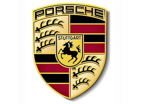
The emblem of the Porsche brand depicts a reared horse, which is very symbolic, because this beautiful animal is a symbol of the German city of Stuttgart - the birthplace of this German brand. The dark red stripes that frame the stallion, as well as the antlers are elements of the coat of arms of the Kingdom of Württemberg, whose capital is again the city of Stuttgart.
Volkswagen

The emblem shown is a combined monogram of the letters V and W, designed by Porsche employee Franz Xaver Reimspiess. However, it was not always like this: during the Second World War, the logo symbolized the swastika, but after the defeat of Germany, it underwent significant changes and became what we are used to seeing it.
AMG

Mercedes-AMG GmbH or AMG is a company (currently a subsidiary of the Daimler AG concern) that produces powerful sports modifications of cars from a well-known European manufacturer.
They are distinguished by a simple and elegant logo, consisting of three letters - after the names of the founders of the company and the name of the city where the history of the company began (Aufrecht Hans-Werner, Melcher Erhard, Grossaspach, Germany).
A more complex logo in color or black and white is also used. It is a circle with inscriptions around the circumference: at the top - AFFALTERBACH (the city where the company is currently based), at the bottom - AMG. Internally, the field is divided into 2 halves, in which are placed the images of a fruit-bearing tree (the symbol of the city) and a valve with a spring and a pusher cam - as a symbol of the company.
Brabus

In 1977 Klaus Brackman and Bodo Buschmann set up an aftermarket car tuning company in Bottorp, Ruhr, Germany. Today Brabus (named after the first syllables of the founders' surnames) works with the brands Mercedes, Smart, Maybach.
Despite the fact that Brabus still retains the status of a tuning company, cars marked with a simple but recognizable logo - a double B in a transparent circle and the Brabus inscription have long been popular as a symbol of high class and prestige.
Borgward

Founded by Carl F. W. Borgward in 1919 in Bremen, the automobile company during its existence (until the 60s of the twentieth century) produced several brands of cars - Borgward, Hansa, Goliath, etc.
The brand was revived in 2015 thanks to the founder's grandson Christian Borgward and investors from China. The logo is an image of a cut diamond with four triangular faces painted in the colors of the Bremen flag (2-red, 2-white) and the company name in the center.
Artega

The German company Artega Automobil GmbH & Co. KG, which produces stylish and comfortable sports cars, has become a real source of pride for the inhabitants of the small town of Delbrock in North Rhine-Westphalia. This happened largely due to the fact that the logo of the company, almost completely repeating the coat of arms of the city, brought him worldwide fame.
ABT

In the summer of 2016, ABT Sprtsline celebrated its 120th anniversary. The company is known for unique modifications of Audi, VolksWagen, Skoda, Seat cars using sports suspension elements, alloy wheels, aerodynamic body parts and forced engines.
The logo is simple and solid - it bears the name of the company, which it received in honor of the founder Johann Abt.
Apollo Automobil
The German company from Denkendorf (formerly Gumpert Sportwagenmanufaktur GmbH) is the brainchild of Roland Gumpert. During his leadership of the Audi Sport division, the auto giant's team has achieved 4 victories in the overall standings of the world rally championships and 25 in individual races of these competitions.
The company's logo - the image of a silver calipers in the form of the letter A on a black heraldic shield flaunts several famous supercars such as the Apollo Sport and Apollo Arrow.
Bitter

Erich Bitter Automobil GmbH is the company with which the founder, Erich Bitter, made his dream come true. The former racer was able to establish small-scale production of luxury sports cars in Germany and Austria. Among the most successful models is the Bitter CD, which connoisseurs call nothing other than the "dream machine".
The modern company logo is a large B, retaining the familiar shape of the first emblems that included the full company name.
EDAG

In 1969, Horst Eckard _ created Eckard Design, which today is known as a developer and manufacturer of high-tech products, including automobiles. In the automotive industry, EDAG Engineering GmbH, based today in Wiesbaden, is known for its company that boldly implements the latest technological solutions, such as 3D printing of the car body and the integration of the Internet of Things into the car. Examples include EDAG Light Cocoon and EDAG Solumate.
The digging logo is a monogram made in a technogenic futuristic style of letters E and D.
Isdera

The small car company Isdera GmbH (Ingenieurbüro für Styling Design undRacing) is well known to connoisseurs as a manufacturer of luxury cars such as Isdera Imperator, Commendatore, Silver Arrow and Autobahnkurier. All cars are handcrafted exclusively to order, which can only be left by phoning the founding owner Eberhard Schulz.
The company logo depicts a proud eagle against a sky-blue background. As a symbol of freedom and the personification of the outstanding power and speed characteristics of the brand's cars.
Domestic car industry logos
Derways

Initially, this company was engaged in the production of cars of its own design, and the presented logo adorned them, but then it went bankrupt and, in order to somehow survive, was forced to give part of its capacities for the assembly of cars from Chinese manufacturers. Today, all the conveyors are already occupied with this assembly, so cars with the Derways emblem are no longer leaving them. By the way, both the name and the logo are formed by two words "Der" (abbreviation of the founders' surname - Derev) and "ways" (from English "roads").
KamAZ

The emblem of the KamAZ automobile brand depicts a galloping horse, and its mane seemed to be swept away by the wind. By the way, this is not a simple horse, but a real steppe argamak, famous for its endurance.
ZIL

ZIL, also known as the Likhachev Plant, existed for quite a long time (1916-1944) without a logo at all, until the designer Sukhorukov suggested using the stylized abbreviation of the plant's name as an emblem, which, by the way, later became a trademark as well.
YaMZ

Today the emblem of Avtodizel is formed by stylized 3 capital letters of the previous name of the enterprise - Yaroslavl Motor Plant.
UAZ

UAZ is an abbreviation for the name "Ulyanovsk Automobile Plant", which produces domestic four-wheel drive vehicles. It formed the basis of the corporate emblem, and with it the "circle with a swallow" - a kind of symbiosis of the stylized letter "U", a V-shaped engine and a 3-beam Mercedes star.
GAZ
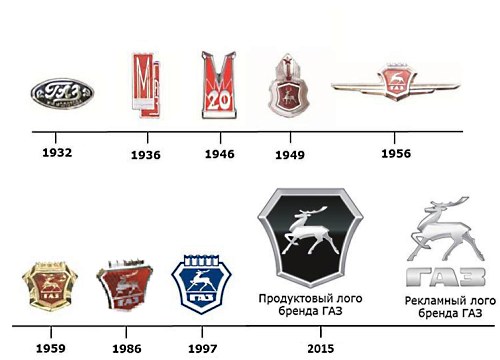
This emblem belongs to the Gorky Automobile Plant located in Nizhny Novgorod. The coat of arms of this city formed the basis of the logo, however, only in 1950. Up to this point, the company has copied in every possible way the Ford concern and its logo as well.
Moskvich

This logo was developed in the 80s. It is presented in the form of the letter "M", stylized as a battlement of the Kremlin wall. This emblem is currently the property of Volkswagen AG.
Vortex

Vortex (translated as "whirlwind, circulation") is a brand belonging to the Taganrog Automobile Plant, under which the serial production of licensed copies of Chery Automobile is carried out. Even their logo is an upside-down emblem of the originals and at the same time the capital letter of this trademark, enclosed in a circle.
Marussia

The Russian automobile company Marussia Motors (2007-2014) was engaged in the production of sports cars to a greater extent, premium class. The letter "M" is visible in the silhouette of each model of this brand. It is also read in the logo. The color scheme in which the emblem is made duplicates the Russian tricolor: white, blue, red.
TAGAZ

Founded in 1997, TaGAZ was declared bankrupt in 2004. The enterprise produced cars Daewoo, Hyundai, Citroen assembled in Russia, as well as several of its own models. The company's logo is an oval with two triangles inside, the exact meaning of which, and whether it was at all, is unknown.
VAZ (Lada)

Until 1994, the VAZ (Lada) company logo was presented in the form of an oval and a rook, but then the emblem underwent some changes, and its modern version looks like this: a rook under sail, made in a new graphic outline, only the white and blue color remained unchanged. This emblem symbolizes the location of the VAZ (Lada) car manufacturing plant - Samara region, where the Volga River flows, along which goods were transported on Ladya in ancient times.
French logos
Bugatti

The founders of the French car brand Bugatti chose an oval in the shape of a pearl as the emblem of their company. Along the perimeter, this oval is also framed by pearls in the amount of sixty pieces. In the center of the oval are the initials of the founder - Ettore Bugatti. Well, and, of course, the emblem contains the very word "Bugatti".
Peugeot

The lion, which adorns the emblem of the French automobile company Peugeot, was borrowed from the flag of the province where the Peugeot manufactory, the progenitor of the modern automobile brand, was located. During its existence, the emblem underwent many changes: the lion turned in the other direction, and reared up, and opened its mouth, at one time only one lion's head was depicted on the emblem. Today she is like this.
Citroen

The well-known "herringbone" depicted on the Citroen logo is a schematic drawing of the teeth of a chevron wheel. The founder of Citroen - Andre Citroen, it was with their release that he began his ascent to the top of the automotive industry.
Renault

A diamond is depicted on the yellow background of the presented emblem - a symbol of prosperity and optimism. In this case, each side of the rhombus is located on top of the other side. And since in reality this figure does not exist, the developers seem to tell us that they are able to bring the impossible to life.
Romanian emblems
Dacia

The modern version of the automaker's logo was developed in 2014 and is an inverted silver “D” with the company's name depicted on a horizontal line.
Aro
The company was founded in 1957. The main products of the automaker are off-road vehicles supplied to the Armed Forces of Romania.
Aixam-MEGA

The French company Aixam is known as a manufacturer of small cars, which do not even require a driver's license to operate.
The logo is quite simple - a dark blue circle with a red border, a silver letter A inside and the name of the company (AIXAM) below it (in the original version, the inscription took the place of the crossbar in the letter A).
With the start of the production of the MEGA auto brand - compact sports cars with powerful engines and excellent speed characteristics, the company changed its name to Aixam-MEGA.
The car of this brand flaunts a modified logo - in the blue circle there is an image of a bull ready for a dash, stylized in the form of the letter M, symbolizing power and speed, and the MEGA inscription took place under it.
DS
DS automobiles - originally a PSA sub-brand under which premium cars were produced, is now a standalone premium auto brand. In addition to the explicit reference to the well-known Citroen DS, the abbreviation successfully portrays the uniqueness of the brand (pronounced déesse, translated from French - goddess)
The logo took a lot from the "chevron" Citroen - familiar three-dimensional angular silvery figures are added to the name of the brand.
Microcar

Since 1984, the French company has been producing two- and four-seater minicar city cars, license-free vehicles and ATVs. After the merger with LIGIER, the brand retained its independence and production base, continuing to produce agile cars for city streets with excellent high-speed performance on the highway.
The French car logo, a red oval containing the company name in white letters, is well known in Europe and is gaining popularity in other markets.
Ligier

Ligier is a French carmaker named after founder Guy Ligier. The company started out with sports cars and was a regular participant in Formula 1 races from 1976-1996.
Racing history is reflected in the company's emblem of the crossed national flag and the F1 finish flag, although it does not reflect the modern direction of activity - the production of city cars and electric vehicles.
Venturi

Venturi Automobiles is a company from the Principality of Monaco, whose activities began with the production of luxury sports cars. Currently, the main direction is the creation and production of electric vehicles of various classes. In 2015, the VBB 3 would have set the world speed record for electric cars - 386.757 km / h.
Initially, the company logo included heraldic elements - an azure triangular shield with an image of an eagle sitting on its arm with outstretched wings under the sun was located on a red oval. Currently, the emblem has become much simpler - only the letter V remains, resembling a stylized image of a bird.
Alpine

Founded in 1955 in Dieppe by racer Jean Rédélé, Alpine specialized in the production of sports cars based on Renault. Success, in particular a number of high-profile victories at the Monte Carlo Rally and in other competitions, led to the fact that for a long time the company played the role of the official sports division of Renault. Currently, the French auto giant is making efforts to revive the legendary brand.
The Alpine emblem has remained unchanged since the times of global success - a circle divided into white with a blue letter A (top) and blue with the company name in white letters (bottom).
PGO

The small car company from Saint-Cristol-les-Ales in the south of France is well known to the clientele. The founders Gilles and Olivier (Prevo, Gilles and Olivier - hence the name of the PGO company) relied on the classic exterior of sports cars and convertibles of the middle of the twentieth century and modern equipment.
The PGO logo clearly represents the fusion of tradition (heraldic shield) and modern dynamics (3 speed lanes).
Taiwan badges and logos.
Luxgen

The logo of the brand, a symbiosis of two words - Luxury and Genius, is an image of a stylized letter "L", which is depicted on a black trapezoid framed with silvery sides.
Yulon

Yulon Motor (formerly Yue Loong) is the largest Taiwanese automotive corporation. At production facilities located both on the island itself and in China and the Philippines, the production of licensed models of Nissan, GMC, Mercedes-Benz, Mitsubishi, etc. is deployed.
After the rebranding, which simplified the spelling of the company name in Latin letters, a new logo appeared. Experts say that it has nothing to do with the hieroglyphs used, and tend to see in it a stylized image of a red dragon or a complex monogram of the letters Y (or U) and L.
Denmark car logos
Zenvo
The logo of Zenvo, a sports car manufacturer with a unique and memorable design, clearly shows the hammer of the god of thunder Thor (a character in Germanic-Scandinavian mythology) against a dark background, a symbol of immense power. And this hammer is crowned with the inscription of the same name - Zenvo.
Sweden car emblems
Volvo

The emblem of the Swedish car company Volvo - spear and shield - is the Roman designation of Mars, the god of war. The stripe running diagonally through the grille was originally used as a mounting point for the emblem. Now she plays the role of a brand identifier. In the center of the emblem on a blue background is the name of the company.
Saab

The blue background of the logo of this automaker depicts a griffin (mythical bird) in red with a red crown on its head, and below it is the white inscription Saab, which together symbolizes the power of this brand both over the earth and over the air.
Koenigsegg

The logo of this sports car company is based on the family coat of arms of its founder - the shield, with the rhombuses depicted on it.
Polestar

Polestar is a Gothenburg-based company that is currently Volvo's electric vehicle division.
The logo of the company, in full accordance with the name, has the image of the North Star.
Cars originally from Malaysia
Proton

The largest Malaysian car manufacturer Proton initially produced cars created by upgrading other cars - the Mitsubishi brand. However, over time, original models also appeared. What is noteworthy: during the entire existence of the company, its logo has changed only once: earlier it was created in the form of a crescent and a star with 14 ends, and today it is decorated with the inscription “Proton” and a stylized tiger's head.
Perodua

Perodua is the second largest and most productive Malaysian car manufacturer. The range of the company mainly includes compact cars.
The emblem is a red and green oval, emphasizing the Italian roots of the company, in which the fields of different colors are separated by the outline of the letter P.
Bufori

Bufori is a brand that represents hand-built cars made in the traditions of the American automobile industry of the 30s of the twentieth century. The founders, the Khouri brothers, have coined the name of the company as an acronym for Beautiful - Unique - Fantastic - Original - Romantic - Irresistible.
Is it any wonder that on the logo there is a full name in gold, reflecting the best qualities of the car brand.
Turkish auto badges
Anadol

Considered the first car manufacturer in Turkey, the company was founded in 1966. The Anadol logo consists of two circles, one against the other. In the central one, a deer is drawn against a blue background, and the name of the automaker flaunts on the second, executed in black.
Italian emblems
Abarth

Abarth Joint Stock Company - once a stand-alone company now wholly owned by Fiat - has been making sports cars since 1949. It owes its name and logo to its founder Karl Abart, who adorned his creations with a yellow-red (with the colors of motor sports) a shield with a scorpion (his astrological sign), a personal inscription and a stripe in the color of the Italian flag, which together symbolize power and strength, the ability to resist all difficulties on the way to excellence.
De tomaso

The logo of this company, which produced only racing cars until 2004, changed only once - in 2009, and then only slightly. Previously, it looked like a symbol of the ancient Egyptian goddess of fertility against a background of white and blue flowers. With the change of leadership, the icon became more geometric, and the background was completely abolished.
Lancia

The first Lancia emblem appeared in 1911 thanks to the development of Carlo Ruffia, who put in it a 4-spoke steering wheel, shield and flag on a spear. Of course, during all this time it has changed more than once, but the original idea was always read. Modern interpretation is no exception.
Alfa romeo

The logo of this famous automobile company is easily recognizable, and all because the draftsman who developed it put one very interesting symbol in it - a snake that swallows a person. And although today, in a tribute to fashion, it looks more like a fire-breathing dragon, its essence has remained unchanged: it, as before, means a readiness to destroy ill-wishers and enemies. A white flag on a white background, located nearby, only emphasizes these sentiments, at the same time recalling the exploits of the Milan Giovanni, who fought for the return of the Holy Land to Christians.
Both of these symbols are framed by a blue circle, which contains the abbreviation for the name of the company.
Ferrari

The renowned sports car manufacturer today adorns its cars with the “golden” (an important color in the history of the city of Modena) a shield-shaped logo depicting a prancing horse. This horse migrated here from the fuselages of the planes of the famous aviator F. Baracca: the parents of the hero of the First World War, after his death, simply presented this logo to Enzo Ferrari and offered to use it in tribute to the memory of Baracca and just for good luck to the racer, to which the latter agreed. In addition to the horse on the Ferrari emblem, you can see the Italian flag drawn into the stripes, as well as the letters S and F - the abbreviated name of Enzo's team - Scuderia Ferrari (translated as Ferrari Stable).
Fiat

This brand is easy to recognize by its logo, because, firstly, it is very simple - it is formed by one company name, and, secondly, it practically did not change over time (except, perhaps, the very first version), more precisely it changed , but only in form and color - the font and the absence of any kind of images were and remain indestructible.
Pagani

This simple emblem, which does not conceal any hidden meaning) is well known to those who are interested in expensive and ultra-fast sports cars, because it is precisely to produce them that Pagani is aimed.
Maserati

Inspired by the statue of Neptune, which at one time could be admired in the park of Bologna, the Maserati brothers chose a trident for their company logo. However, the history of the automaker is not at all connected with this character, rather, only the weapon of the heavenly God was awarded the honor: the brothers thus perpetuated the honor and their gratitude to the savior Alfieri Maserati. With a pitchfork in his hands, the man not only saved the life of one of the brothers by attacking a wolf from one of the forests of Bologna, but also became a symbol of courage in salvation. This is how the stylized trident with the Maserati signature appeared in the company's logo.
Lamborghini

The emblem of the famous company Ferruccio Lamborghini appears to be very ambiguous. More precisely, everything is quite simple with the emblem itself: a golden bull with the signature of Lamborghini, enclosed in a somewhat "smoothed" "inflated" inverted triangle. But the history of its creation has several versions: 1) the bull is a symbol of the sign of Taurus, under which the founder of the company was born; 2) the bull is a powerful challenge for the horse - the symbol of the rival company (Ferrari); 3) bull - a symbol transferred from the coat of arms of the Ferruccio Lamborghini company; 4) the bull is the indestructible power of the tractors, the production of which was originally the company.
Mazzanti

Mazzanti Automobili is a small Italian company (in the past, an auto laboratory), whose products are supercars of original design and hand-made assembly.
Named after founder Luca Mazzanti, the company places a stylish logo on its cars - a blue and yellow (in the colors of the city of Pisa) shield with the name and a stylized image of calipers (blue on a yellow field), at the top of which there is a stripe in the colors of the national flag.
Intermeccanica

Construzione Automobili Intermeccanic is an automobile company with Italian roots (founded in 1955 in Turin) and an international history - moving to the USA and currently located in Canada. The main products are modern replicas of famous cars. Today the company is working on the production of electric vehicles.
International history is also reflected in the logo - on a traditional Italian shield with an indomitable bull, you can see fragments of the flags of the United States and Great Britain (Canada formally remains part of the British Empire).
"Japanese"
Toyota

Toyota has been faithful to its logo since 1989. And it is represented by a very intricate "twisted" figure of ovals, which includes all the letters of the name of the native company, but the decoding of this logo does not end there: "crossed" ovals are a symbol of a strong relationship between the company and the client; background space - the boundless potential of Toyota and the idea of the global expansion of its technology. There is also a version that says about the stylization of the image of "thread in a needle" in the company logo, as a tribute to Toyota's weaving past.
Datsun
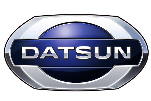
The Nissan brand has enclosed in its emblem a blue bar with the word "Datsun", located on top of the "rising sun", in which lies the essence of the company: the sincerity of a hot star can lead to success-climbing. Blue, the dominant color in the logo, speaks of the honesty and reliability of the automaker.
Toyota harrier
The name of this SUV is translated into Russian "harrier", so it is not surprising that this particular bird of prey of the hawk squad formed the basis of the model's emblem. By the way, in our latitudes this car is better known under the name Lexus RX (with the corresponding logo).
Toyota Altezza

Originally a Japanese car for the domestic market, everyone else knows it as the Lexus IS. But since this article is about the emblems of the cars of the world with the names , then it is its logo that helps to recognize Toyota Altezza: a pentagon with a huge letter "A" inside, the horizontal line of which forms the name of the model.
Nissan

This emblem is over 80 years old. It is formed by the rising sun and the name of the manufacturing company inscribed in it, which together symbolize success through sincerity.
Toyota crown

Crown is the oldest Toyota sedan with the crown emblem, which is quite logical, because "crown" means "crown".
Lexus

The well-known subsidiary of the Toyota brand has a rather uncomplicated logo - the brand's capital letter inscribed in an oval. The word lexus itself is a transformation from luxury, which is why the emblem symbolizes it, as if hinting to motorists that luxury is beautiful in itself, and therefore does not require any additional accents to attract attention.
Toyota Mark X

This emblem of the famous Toyota concern speaks for itself. It is present only on one model of business class cars - Mark X, the last letter in the name of which (only stylized) is the brand logo.
Subaru

"Heavenly inspiration" - this is how the Subaru logo can rightfully be described. The stars symbolizing the constellation Taurus represent the number of companies that have merged to form the parent company Subaru.
Mitsuoka

Mitsuoka Motor (Toyama City) is an automobile company that offers original design cars in the style of British cars of the middle of the last century, micro cars for the city, and sports cars.
The basic logo resembles the first hieroglyph of the manufacturer's name installed on the wheels; for European, in particular the British, markets, an emblem in the form of a silvery seven- or eight-pointed star is often used.
Isuzu

The logo of the company, one of the first to start producing cars with a diesel engine, at first glance seems very simple: the usual inscription-the name of the company. However, even it has a certain meaning: the stylized first letter speaks of the stimulus for growth and development, red - the warm hearts of employees.
Mazda

The company, founded in 1920 in the city of Hiroshima, decided to give its name to the great Zoroastrian God - Ahura Mazda. Its logo, equal to the company's name itself, has undergone changes since 1936: from the stylized capital letter "M" (the symbol of the emblem of the coat of arms of the city of Hiroshima), which took a horizontal position over time, to the modern emblem in the form of a circle, which means the sun, which carries " winged "letter M (she is an owl, she is a tulip).
Toyota Estima

A simple E-shaped logo enclosed in a trapezoid is the hallmark of the Japanese Toyota Estima minivans. In other countries, this car was delivered under the name Toyota Previa with the standard Toyota emblem.
Infiniti

The Infiniti emblem is a display of the endless possibilities of cars of this brand, stylized into an endless (running into the distance) road.
Toyota Century

This model of the executive class received its name Century (in translation "century") in honor of the 100th anniversary of the founder of the company. For the same reason and for harmony with the name, the phoenix bird, a symbol of immortality, was enclosed in its emblem.
Suzuki

The emblem of this automobile giant outwardly very much resembles a hieroglyph, although in fact it is not. This is just a properly stylized capital letter of the company name and, at the same time, the surname of its founder (Michio Suzuki).
Toyota Soarer

Today, cars with such an emblem do not leave the assembly line, but not so long ago (1981-2005) they adorned the coupe of the GT class. The name of the model is translated as "soaring", hence such an interesting logo - a lion (a symbol of strength and courage) with wings.
Honda

The emblem of the industrial company "Honda" is the stylized first letter of its name. And it got the name in honor of its founder - Soichiro Honda.
Scion

The company, which produces cars in a single configuration, while working on the logo, plunged into the marine theme, enclosing the first letter of its name in the image of a stylized shark - a symbol of fans of ocean extreme sports.
Mitsubishi

The “Three Diamonds” in the name of the company are reflected in its logo as well. The Mitsubishi logo is a kind of fusion of the heirlooms (coat of arms) of the Iwasaki clan, revealed in the image of three rhombuses, and the Tosa clan, which is based on three oak leaves growing from one point.
Toyota Alphard

This logo of one of the Toyota models contains the star of the constellation Hydra, after which the first was named.
Daihatsu

Daihatsu Motor Co., Ltd is a Japanese manufacturer of compact cars. In the combination of the first hieroglyphs of the original name "Ōsaka engine manufacture", the symbols change the shape and sound, as a result of which the modern name was formed.
The logo is simple - capital letter D.
Spanish stamps
Tramontana.

The sports car manufacturer chose the bird figure as its emblem, changed it significantly and added the name of the company below.
Aspid

Aspid is a family of venomous snakes and a subsidiary of IFR Automotive with a thematic logo.
Seat

The stylized letter S on a red background is the emblem of Sociedad Española de Automóviles de Turismo, known worldwide under the abbreviation Seat.
Tauro sport

Tauro Sport Auto is a manufacturer from Valladolid, which began its activity in 210 and gained fame in the world markets for its luxury sports cars.
The name Tauro (Spanish for bull) is reflected in the logo - in a red circle, a swift and powerful figure of an animal. Around the circle is the full name of the company.
"Chinese"
Lifan

The name of this company is translated into Russian as “to sail in full sail”, so it is quite natural that sailing ships are depicted on its logo (in the amount of 3 pieces).
Landwind

This emblem can only be seen on Chinese pickup trucks and SUVs. It looks like an elliptical ring with a red rhombus inscribed with metal edges and a stylized letter L inside.
Changan

One of the most recognizable logos of the Chinese car industry: the blue circle inside it is a symbol of planet Earth, environmental friendliness of production, the additional background on which this circle is located represents the use of modern technologies and constant movement forward, and the letter "V" (from Victory, Value) - the central element of the composition indicates Changan's constant pursuit of victory and eternal values.
Foton

State Automobile Company of China with a logo in the form of a triangle, divided by two oblique lines into 3 parts, very similar to the adidas brand name. What it means is a mystery, but the main thing is not what the emblem means, but whether it is recognizable.
Tianye
Founded in 1992, the Hebei Zhongxing car company has developed a custom logo displaying two parallel upward lines bent from 2 places in the form of a kind of steps, enclosed in an oval with a red background.
Roewe

The name of the company, which makes luxury cars, includes 2 characters: "rong" and "wei", meaning "great power." In addition, the name itself is consonant with the German word "loewe", which means "lion" in Russian. This explains the presence of two golden lions on the red and black background of the shield of the company logo.
Chery
Chery Automobile Corporation has embedded its name's interlocking capital letters in its logo, which merge into the letter "A", representing the first class of cars, which is "supported" by the outlines of hands, symbolizing unity and strength.
Beajing-Jeep

The logo of the subsidiary of the major auto manufacturer Beijing Automobile Works is a stylized image of the abbreviation “BJC”.
Hafei

2006 - the time of the transformation of the company into an independent national auto-building holding and the release of a number of its own cars and engines. At the same time, this logo was invented - an ancient Chinese shield with stylized waves, which symbolizes the bed of the Songhua River flowing through the ancient city of Harbin.
FAW

First Automobile Work depicted on its logo a unit (a symbol of primacy) with schematic wings behind its "back" (a symbol of an eagle conquering space) and the name of the brand that personifies the corporation.
Great wall

The logo of the company, founded in 2007, consists of a circle, into which a stylized battlement of the Great Wall of China is gracefully inscribed.
BAIC

Created in 1985, BAW (Beijing Automobile Works), now known as BAIC GROUP, in its logo enclosed metal, concave to the center, lines framed by a circle, reminiscent of the shape of an hourglass.
JAC

The emblem of the company, founded in 1999, is an ellipse with a five-pointed star and the inscription “JAC MOTORS”.
Dongfeng

Founded in 1969, the logo of Dongfeng Motor Corporation resembles the opposing yin and yang, stylized in red and enclosed in a circle.
Haima
The company dates back to 1990 as a result of the collaboration between FAW and Mazda. This, in fact, was reflected in the company's logo, which resembles the emblem of Mazda with a schematic silhouette of Ahura Mazda - God personifying wisdom, life and light.
JMC

The logo of the largest company Jiangling Motors Co, located in Nanchang, is represented by 3 red triangles connected by vertices in the center, at the bottom of one of which is the abbreviation of the name "JMC".
Brilliance

The logo of the company, which has recently appeared on the car industry market, conveys all the shine of the cars themselves. Intertwined lines in the form of two silvery hieroglyphs speak of beauty and superiority.
Geely

Founded by Mr. Shufu in 1986, the company is based on the image of a stylized wing, stretching up to the sky, located in the center of a framed circle with the words "Geely". According to another version, the picture presented is a kind of image of a mountain against the background of the sky.
BYD

The company of distinctive cars did not strive to conclude something special in its logo, so the emblem with the brand name enclosed in an oval, somewhat reminiscent of the modified BMW logo, became its property.
Zotye
The Zotye company was founded in 2005 and introduced the graphic letter "Z" as its logo, located in the center of a stylized square.
Baojung

Budget cars under the Baojung brand come out under the logo in the form of a framed, stylized horse head. By the way, the name of the company is translated exactly like this - “precious horse”.
Hawtai

The company's cooperation with Hyundai Motors, which lasted several years, left a mark on its logo, placing a half-letter "H" in a metal-colored ellipse.
Xin kai

Founded in 1984 and trusted by the police, the Supreme Court, the Prosecutor's Office, the Ministry of Justice and others, the company has incorporated the capital letters "X" and "K" into an ellipse shape in its logo.
Haval

Haval is a new (created in 2013) Great Wall brand of modern SUV cars. Cars are marked with a simple logo with the full brand name.
Wuling

SAIC-GM-Wuling is a mass-market and commercial vehicle company in China. One of the main activities is the production of micro vanes.
The cars of the brand adorn the logo in the form of the letter W, composed of images of five faceted red diamonds.
Qoros

Qoros Auto Co., Ltd is a Shanghai-based car manufacturer co-founded by Chinese and Israeli investors. The production of cars started in 2013, the product line includes high-quality crossovers, sedans, hatchbacks at affordable prices.
The company's logo is the capital letter Q, and the manufacturer suggests taking the name as a homonym of the Greek chorus (chorus), in which everything sounds as harmonious as possible.
Gonow

GAC Gonow is a Chinese manufacturer of light trucks, crossovers and SUVs. In the domestic market, the products are supplied under the brand name GAC Gonow, in world markets it is known as Gonow.
The company logo consists of 2 concentric circles (inner - stylized G), which mean “as one heart”, “working together”, “walking in step” or harmony in traditional Chinese culture.
Korean car emblems
Hyundai

On the one hand, the emblem of the famous Hyundai brand is a simple stylized spelling of its capital letter, and on the other, it is the personification of two people shaking hands as a symbol of mutually beneficial cooperation. At least, this is how the creators explain its meaning.
SsangYong

Cars with this logo are especially popular in our country, but not every owner of them knows that the familiar emblem contains the wings and claws of a dragon - a strong and powerful creature that has passed into it from the company's name, which translates as “two dragons”.
Daewoo
The Daewoo company (translated as “Great Universe”) has chosen the heraldic symbol “lily” as a trademark - the personification of purity and grandeur.
Kia

This seemingly simple word stands for "Enter the world from Asia." The use of such a loud name and its inclusion in the logo, for sure, also played an important role in the fact that today this Korean manufacturer really knows the whole world.
Renault-Samsung

The Renault-Samsung logo is a metal ellipse - a symbol of the company's endless possibilities.
Swiss car brands
Acabion

A simple logo (stylized spelling of the company name) of an unusual automobile company that directs all its efforts to the development of fundamentally new types of transport, therefore cars with such an emblem always have interesting outlines and non-standard fuel sources.
Sauber

In its emblem, the famous Swiss sports car manufacturer enclosed the capital letter of the company name (it = the surname of the founder - P. Sauber), inscribed in a red circle, symbolizing confidence in their strengths and capabilities.
Austrian stamps
Holden

The company, founded by James Alexander Holden in 1856, chose the "Wimbledon Lion" - the symbol of the British Royal Exhibition of 1924-1925 in choosing a modern and modern image of the brand.
FPV

The logo of the company, which opened in 2002, is quite recognizable. It is represented by an ellipse-shaped emblem, inside which is a falcon (a symbol of courage, victory, aspiration for the future) and capital letters of the brand name.
Poland car emblems
Arrinera

Arrinera Automotive SA, a sports car company since 2008, has chosen two stylized capital letters of its name as its emblem, positioned above two metal triangles in a mirror image.
FSO

Fabryka Samochodow Osobowych has divided its logo into 2 parts, united only in red, as a symbol of passion, reliability and quality. In the first part, the letters F and S are encrypted inside the letter O. The second is represented by a stylized abbreviation of the company.
Czech car icons
Skoda

The Skoda logo has undergone a number of changes over its long history. Today it is a green “winged” arrow (symbol of environmental protection) on a white background with an “eye”, placed in a ring with the name of the company. The wing here is a symbol of technological progress, the arrow is a symbol of the latest technology, and the eye symbolizes the company's open-mindedness.
Kaipan

The Kaipan company began its history in 1991 and a significant role in this beginning was played by the Lotus Super Seven car, the name of which was transformed into the emblem of the new brand - two crescents of different sizes, located one at the same ends up, like the petals of a lotus flower.
Tatra

The firm, which currently manufactures backbone heavy trucks, has created a logo without too much intricate plots - a red circle with a stylized image of the name "Tatra".
Indian car logos
Mahindra

The endlessness of roads and future prospects are reflected in this logo belonging to one of the "old-timers" among car manufacturers - the company Mahindra, founded in 1945. The emblem consists of three red stripes tapering towards the top, which merge into an elliptical shape.
Hindustan

The Hindustan Motors Limited emblem encapsulated the stylized white and yellow capital letters of the company name, set against a blue background, the color of eternity and constancy.
Maruti Suzuki India Ltd

Maruti Suzuki India Ltd is one of the largest companies in the country. Its emblem is a kind of component of two logos, one of which is the logo of the Maruti company (stylized blue wings raised up), the second is Suzuki (graphical red letter S) and the inscription consisting of the names of these two companies.
Canadian car brands
Asuna

The brand, created as an analogue of Geo, was opened by General Motors Corporation in 1993. Its symbol is a stylized triangle - a symbol of conquering peaks - and the inscription "Asuna".
Ukrainian emblems
Bogdan

The company engaged in the production of VAZ 2110 cars has a very interesting ornate logo. It was based on the letter B, enclosed in an ellipse (a symbol of stability), which is presented in the form of a sailboat (a symbol of good luck on the road), which opened the sails (a symbol of a fair wind). The emblem is colored green and gray to represent the company's excellence, growth and renewal.
ZAZ

Since 1960, the Zaporozhye Automobile Plant has produced a line of all well-known humpbacked beauties "Zaporozhtsev", which were distinguished by their affordability. From this period, the emblem appeared, decorated with a stylized letter Z, enclosed in an ellipse.
Brazilian logos
Amoritz

The creator of the Amortiz GT was once the designer of the Volkswagen company Fernando Morita, who put its stylized name in the logo of his company.
Holland / Netherlands car logos
Spyker

Founded in 1898, Spyker began with the production of exclusive hand-assembled sports cars. And, despite a considerable break in work (from 1925 to 2000), today she again pleases her clients. The chosen logo of the company only confirms a significant claim about itself in the automotive market: a wheel with a propeller and spokes is a symbol of the sophistication of a sports car and the boundless power of an aircraft.
Donkervoort

Donkervoort, based in Lelystad, has chosen stylized red fenders as a logo for their sports cars - a symbol of flight, speed and freedom - with the words "Donkervoort" in white over them.
Iranian car emblems
Iran

The logo in the form of a shield, which depicts the stylized head of a horse, as a symbol of speed and strength, belongs to Iran, the most famous "brainchild" of which is the Khodro Samand model, which only emphasizes the relevance of the chosen emblem, because the word "samand" in Russian means " fast-footed horse ".
Uzbekistan
Ravon

Automotive brand founded in 2015 in Uzbekistan. RAVON stands for "Reliable Active Vehicle On Road".